
Do you love beautiful maps? The Atlas of Design has been reprinted and is now available for purchase. Published by the North American Cartographic Information Society (NACIS), this compendium showcases cartography at some of its finest. The atlas was originally published in 2012 and features the work of 27 cartographers. In early 2012, a call for contributions was sent out and 140 entries from 90 different individuals and groups submitted their work. A panel of eight volunteer judges plus the book’s editors evaluated the entries and selected the finalists.
The focus of the Atlas of Design is on the aesthetics and design involved in mapmaking. Tim Wallace and Daniel Huffman, the editors of Atlas of Design explain the book’s introduction about the focus of the book:
For many people, maps are solely about data. As far as these users are concerned, as long as the content is present and legible, the map “works.”
While they are not necessarily wrong in their assessment, a case can and should be made for the importance of aesthetics in cartography. Content must take a form, and how something is said is just as critical as what is said. Aesthetics are not simply the wrapping paper we put around the data when making a map. They are the framework in which that data is presented.
Some Map Examples from the Atlas of Design
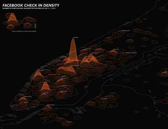
Map of Facebook check in density across New York City with each contour representing a 0.75 increment change in Facebook checkins per acre. This map shows the number of check ins per 100 acres for the week of July 5 -11, 2011. The map is part of a series of maps created by a team from the Spatial Information Design Lab. The project the map was developed for is called “We are here now” and looks at what the team calls “Social Media and the Psychological City.”
Tim Wallace dove into the details of radio reception for Boston Red Sox versus the New York Yankee games in this map entitled “Two nations, over the air, Portrait of a rivalry in radio waves.” Wallace looked at broadcast areas for affiliate stations for each of the two teams using parameters provided by each radio station and The M3 Conductivity Map. The map was first published and discussed on Boston Globe’s web site.

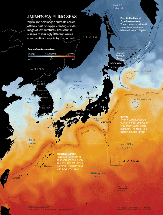
Virginia White Mason of National Geographic Magazine created this map showing the marked difference in temperatures ranging from Arctic to Tropical around Japan. The maps also received an honorable mention at the Cartography and Geographic Information Society’s (CaGIS) 38th map competition in 2010. This was the same year that Dave Imus’ “Essential Geography of the United States Mapped” won Best of Show.
| More Maps |
|---|
| • Essential Geography of the United States of America • Six of this Year’s Most Interesting Maps • Map of McDonalds |