
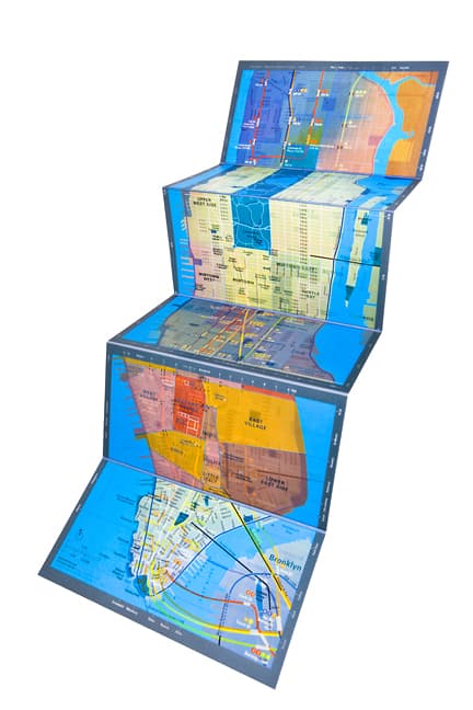
Urban Mapping, a small company based out of San Francisco has created the Panamap.
The map is created using layered plastic sheets that, together, offer three different map views on the same page. Depending on the angle the map is viewed from, the user can see either a street map, subway map, or neighborhoods and landmarks.
Interestingly, while the company is based in San Francisco, only maps New York and Chicago are currently being offered. The maps retail for $20.
The concept is interesting but I have my doubts on its practicality. Try to hold a map at the precise angle to see the needed map could be challenging, particularly out on the street. What if the sun is shining at the same angle you need to hold the map at to see the subway lines?
This isn’t the first forway trying to promote Panamap by Urban Mapping. The company originally launched itself on this product before going bankrupt. It reinvented itself as a licensee of geographic data to such companies as Yahoo!.
You can view an animation of the technology on the Panamap site or check out the demo by founder Ian White on the TechCrunch site.
I don’t get it. I could just as easily put all 3 maps together on one map without the annoying tilt – it would be cheaper and lighter too. The neighbourhood and subway map has so little information anyways that it wouldn’t make the map congested with information. Why not use an aerial map instead as an option? It often helps understanding the area a little better, but that often has too much information to blend with everything else.
I don’t really see the effectiveness of this map, but I can understand why they’re attempting to market them. I guess somebody’s got to come up with a new and innovative way to draw people away from just using mapquest or googlemaps.
I found a great post on Peterman’s Eye that talks about the use of paper maps in a technological world. Great read. SO I will share…
http://www.petermanseye.com/passions/travel/323-on-the-map
Cheers!