
A team of researchers used data from several federal sources and the Oak Ridge National Laboratory to produce the first high resolution map of how food moves around the United States.
Flow maps to show the food supply chain
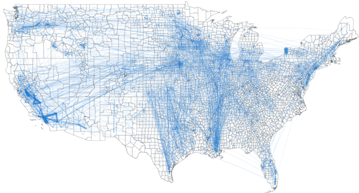
The map shows flow lines representing the volume and end and start point of food flows between counties in the United States.
Data used to generate the Food Flow Model included (among others) data on agricultural and food commodity transfers, county level economic data, and freight movement.
The end map product is a visualization of over 9.5 million links between counties involving grains, fruits and vegetables, animal feed, and processed food items that make up food flows within the United States.

Important food supply hubs in the United States
The model and associated map highlight important hubs of both outflow and inflow of food products.
Los Angeles County in California both ships and receives the highest amount of food. This is driven by both the proximity to highly populated metropolitan centers as well as close access via transportation routes to agricultural areas in the Central Valley.
The top nine counties that ship the most food by kilogram are all in the state of California. Maricopa County in Arizona rounds out the top ten.

The full study details core counties for food supply as well as the flow of how food travels from place to place:
Lin, X., Ruess, P. J., Marston, L., & Konar, M. (2019). Food flows between counties in the United States. Environmental Research Letters, 14(8), 084011.
Konar, M. 2019, October 25. We mapped how food gets from farm to your home. The Conversation.
The data used to make the map has been released as a publicly available CSV file.