
One thing that the COVID-19 pandemic has highlighted is the importance of maps in conveying key data, such as infection trends and active cases. Maps can inform but also deceive, and the pandemic has examples of both. This is also true for other recent disasters such as fires in the Western United States or bushfires in Australia. In fact, deceptive maps have been a long-standing problem that can obfuscate critical information.
Maps have been used to convey critical data to the public during the COVID-19 pandemic, particularly in supporting stay-at-home or lockdown orders. For instance, the World Health Organization (WHO) has placed guidelines that would suggest there should only be one positive test for every ten negative tests in an area testing to show adequate testing and infection rates that could be controlled. However, if maps do not convey the number of tests, and only indicate infections, then the information can be misleading since knowing the number of tests being done in a region is just as critical as the total infections. Simply showing infections could be deceptive to the public.

Another well-known map during the early days of the pandemic was one that showed airline routes around the world as potential ways in which COVID-19 could spread. Many media sites displayed this map showing air routes, where the many links demonstrating a dense network of areas covered by travel.
This created panic among some who assumed that the SARS-CoV-2 virus was automatically spreading in regions where travel had dense coverage, even though we now know that the way the virus spread was uneven even if it spread relatively rapidly globally.[1]
This has been an issue also affecting how media and government authorities have discussed important topics such as regional poverty. For instance, maps have been used in the UK to present regional poverty, often showing regions in northern England as being generally more deprived than those in the southern part of the country.
While this has some truth, the distribution of poverty is very uneven and often local authorities have a mixture of poor and relatively wealthier areas. Using circular Dorling and hexagonal geogrid maps scaled by population density, these maps show more accurate localized poverty rates than maps demonstrating such information by local authorities.[2]
Subtle Map Changes Can Affect Perception
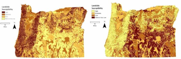
Often, it is subtle changes to maps that can deceive or misrepresent critical data. For instance, smoothing data, changing color hue, or classifying data in a given way can also create small deceptions. Making maps, in effect, presents choices to researchers or analysts and those choices, even if made with good intentions, can create small deceptions that can aggregate to a more unclear or incorrect display of information.

In How to Lie with Maps , Mark Monmonier discusses how maps can be deceiving. For interpreters of maps, it is important that they question the underlying data that makes up a map. For instance, if a map shows the occurrence of an event, would it make sense for that to account for population or geographic differences? This can be an important question to ask.
The choice of colors should be looked at closely. Red often denotes something more dire or severe, but that is not what many creators of maps intent. Additionally, readers of maps should investigate closely how the creators of maps have chosen to represent their data. They could have minimized some results or chosen to cutoff data at certain points. Data could also be out of date and knowing when data were collected is also important.[3]
Factors of color, shape, size, and perspective need to be questions not only for maps but really all types of visual representation. Our tendency is often to let our perceptions help interpret maps for us, but the best choice readers of maps can do is to carefully look at a map and ask basic questions about its data and then look carefully at the descriptive and legend data before making assumptions about what the map is conveying. Ultimately, we should also check the source of the data for any bias or accuracy issues.[4]
Be Critical When Viewing Maps
Maps are both a great tool for telling us an important message using minimal description but they can also be a key part of false narratives or misleading information. We should expect scientists and our government to present accurate data as well as clear ways in which that data are presented; however, as users of maps we also have a responsibility to look closely and ask basic questions before we interpret maps.
Deceptive maps are often made not on purpose but by poor choices by the mapmakers. We, as users of maps, have a responsibility to be critical and discerning before making decisions from maps.
References
[1] For more on the use of maps and how they convey important or deceptive information on the COVID-19 pandemic, see: https://theconversation.com/can-i-trust-this-map-4-questions-to-ask-when-you-see-a-map-of-the-coronavirus-pandemic-141131.
[2] For more on the use of maps to demonstrate poverty, see: https://theconversation.com/even-the-most-beautiful-maps-can-be-misleading-126474.
[3] For more on Mark Monmoier’s book on maps, see: Monmonier, M. S. (1996). How to lie with maps (2nd ed.). Chicago: University of Chicago Press..
[4] For more on reading figures and maps, see: https://theconversation.com/3-questions-to-ask-yourself-next-time-you-see-a-graph-chart-or-map-141348