
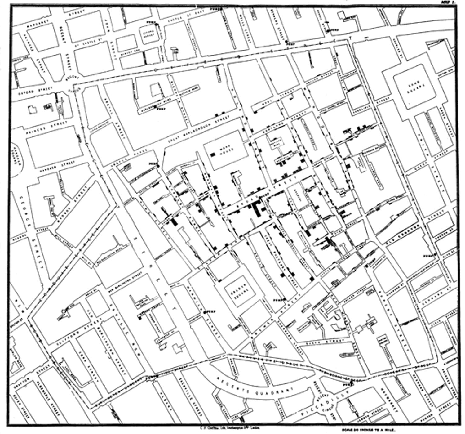
John Snow’s cholera map is one of the earliest documented examples of using spatial analysis to investigate a disease outbreak. Although his famous dot map was created after the 1854 Soho cholera epidemic, it demonstrated how mapping disease clusters could reveal the source of an outbreak.
On August 31, 1854, an outbreak of cholera hit the London district called Soho. Over the course of three days, 127 people died from the disease and by September 10, over 500 had died. Physician John Snow was able, through conversations with local residents, to narrow down his suspicion that the source of the outbreak was a water pump on Broad Street.
Snow commissioned cartographer Charles Cheffins to produce a map showing the locations of public water pumps and cholera deaths, providing visual evidence to support his argument that the Broad Street pump was contaminated. Snow first presented the map to the London Epidemiological Society on December 4, 1854, before publishing an updated version in the second edition of On the Mode of Communication of Cholera.
This early use of mapping in epidemiology is a popular example used in many GIS textbooks and courses to highlight the application of geographic analysis. Although GIS would not be developed for another century, Snow’s work demonstrated the power of spatial analysis to uncover relationships that were difficult to recognize from tables of data alone.
GIS data of John Snow’s cholera map
Readers who want to explore the outbreak using GIS can access the dataset prepared by Robin Wilson of the University of Southampton. Wilson georeferenced a scan of Snow’s original map to the Ordnance Survey National Grid before digitizing the locations of cholera deaths and public water pumps. Wilson has made all of the GIS data freely available in a ZIP file.
The file includes the georeferenced scan of John Snow’s map, shapefiles of the cholera death locations and pumps, and several color and grayscale OS map images. Users can use GIS software such as ArcGIS or QGIS to load the geographic data and georeferenced maps to create their own John Snow cholera maps.
Simon Rogers over at the Guardian’s Data Blog has taken the data prepared by Robin Wilson and used CartoDB to create an interactive map. Rogers opted for the Stamen ‘toner’ as the base map to mimic the original look of Snow’s map. At the bottom of the article, Rogers has made the data available in Google Fusion Tables for those that want to explore Snow’s cholera data further. From there you can create your own map using Google Maps or export the data in KML format.

Snow’s map remains one of the best-known examples of how maps can be used as analytical tools rather than simply illustrations. His work showed that the geographic distribution of events can reveal relationships that might otherwise go unnoticed. Modern GIS has made spatial analysis faster and more sophisticated, but it still builds on the same idea that guided Snow’s investigation of the 1854 cholera outbreak.
