Graduated symbols is one way of visualizing data that can be quantified on a map in GIS. Quantitative data is data that can be express as a quantity, amount, proportion, or range.
For example, if you have a database locating all the birds in an area, the data can be quantified to show the total number of birds in a given space, or a density such as the number of birds per square acre.
When mapping out the location of birds, the data can be symbolized using graduate symbols which displays the values using shapes of varying sizes. The greater the number of birds in a given area or the higher the density of those birds, the larger the symbols will be.
A graduated symbol map uses symbols, most popularly circles, to represent point data at specific geographic locations. The size of the symbols is designed to be directly proportional to the data value or magnitude they represent so that the map reader can easily see geographic areas where the values are high compared to other geographic areas where the values are low.

With graduate symbols, the data is classified
When visualizing GIS data with graduated symbols, the data is categorized, or classified, into ranges that are then assigned a sized symbol. The size of the symbols offers an intuitive understanding of the data magnitude, making it easier for map readers to interpret.
In the example below of a graduated symbol map, cities in the eastern parts of Canada and the United States have been symbolized using graduate symbols based on 2015 population data.
The graduated symbols have been given data ranges based on natural breaks (Jenks) in the population data — this is known as classification. Cities with the smallest population values are symbolized with a very small circle. The cities with the largest population sizes are symbolized with the largest circles.
Graduate symbols are designed to allow the map reader to make easy comparisons. For example, the graduated symbol map below lets the map reader quickly understand that the population of New York City is much higher than the population of Albany.

While graduated circles are a popular shape used to visualize quantitative data on a map, they are not the only shape that can be used.
Graduated symbol map versus choropleth map
Choropleth maps and graduated symbol maps often serve similar purposes but operate on different principles.
Graduate symbol maps are more appropriate when comparing values across disjointed geography — for example, comparing the populations of cities in a country. Choropleth maps use color gradients to indicate varying levels of a particular attribute within predefined regions (such as states or counties).
While graduated symbol maps can represent geographic points as raw values (such as the total population of cities), choropleth maps tend to be normalized. This means that the value gradients represent a proportionality of the data values against another variable. This is the GIS equivalent of being able to compare apples to apples instead of apples to oranges.
Without normalization, larger geographic regions or those with higher populations might misleadingly appear to be of greater significance. For example, a choropleth map may show population as a density such as the number of people per acre by county. For example, California is the the third largest state by area and the most populated states yet it is the 17th densest state in the United States when looking at population density.

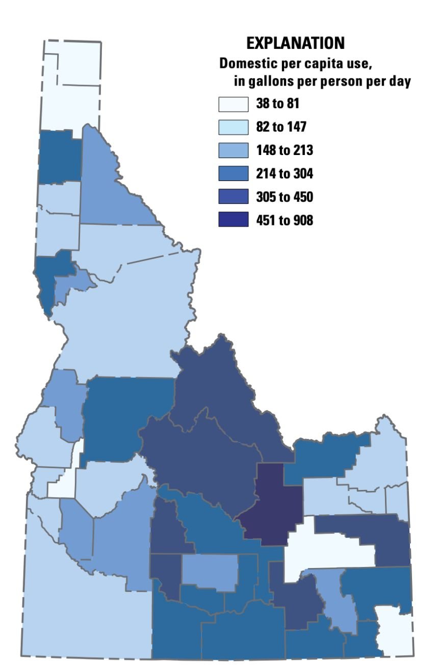
For example, if you are looking to understand which counties in your state have abnormally high water usage, you wouldn’t create a choropleth map of the total residential water usage per county. This is because counties that contain major cities, and therefore a higher population, will always show up in the highest classification.
So, to see if there are counties where the residents are collectively using a higher amount of water, you would normalize the data and divide the total water usage for each county by the total number of residents. The choropleth map would then map out the average water usage per resident by county.
Further Resources:
Christopherson, G. L. (2013). Mapping Quantities: Proportional or Graduated Symbols. Lecture.
Buckley, E. (2013). Understanding statistical data for mapping purposes. Esri.
This article was originally written on August 18, 2019 and has since been updated.
