
At some point in all of our lives our perception of the world began to change- our knowledge of the world, from school or personal travel experience, began to grow in our minds a map of the world which started to encompass more than just our hometowns and the surrounding suburbs. Soon this mental map started to include nearby states or territories, other countries, and slowly but surely a global mental map was created in each of our minds, unique and personal to every one of us.
These mental maps have common elements; for instance, Canada on your mental map will always be Canada, although the outlines may be fuzzy if you aren’t from there or don’t have a specific memory tied to that location. We all generally can place Europe and Asia, India and Australia, South America and Africa on our maps.
Think of the map you learned about the world from in school- what did it look like? Was it colorful or topographical, with carefully outlined international borders or highlighting the physical geographical barriers present all around the earth? Did your teacher point out your country, your state, your hometown? What did it look like?
When you take a closer look at a map you may realize that not all is as it seems. Proportions are off ever so slightly, and the options of maps to look at differ in ways we couldn’t imagine as young students. Everyone seems to have a different idea of how the world looks despite living in this era of satellites and technology, advanced GIS systems, and increasing global communication. In this article we will explore how the maps surrounding us have altered our perceptions of the world and how to be aware of this effect when studying geography and cartography.
The Dilemma of the Map Projection
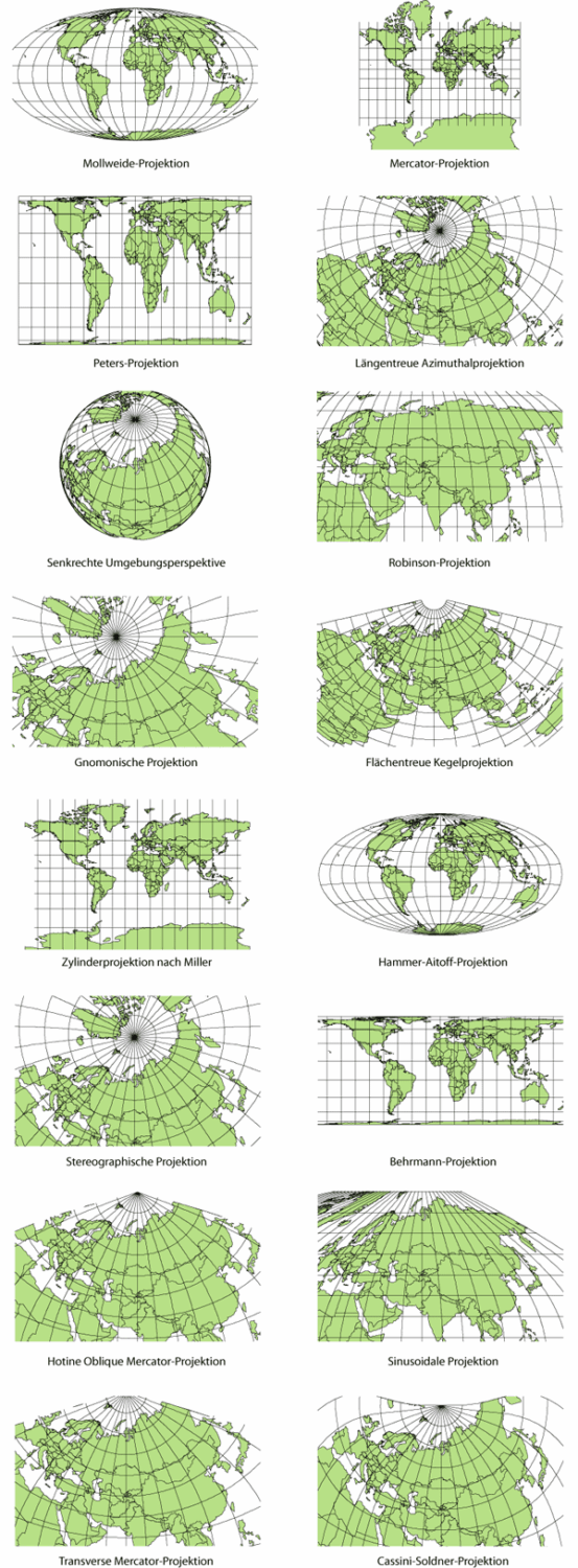
Cartographers for centuries have been coming up against the same problem when attempting to accurately depict a visualization of the earth as we know it- depicting a round earth on a flat surface. The most common map projections (Mercator, Peters, Mollweide, Eckert IV, Goode’s Homolosine) each have critics and fans but were all created to solve a different cartographical problem; all, it can be argued, are attempting to show the world as it truly is.
Mercator’s projection of the world continues to be beneficial for navigation for sailors and pilots, all whom rely on the straight lines depicted on the map which matches up with the four cardinal directions on a compass. The downside to Mercator’s projection is that it is nearly impossible to show both shape and size of the landmasses being shown on a map- one must be sacrificed, and this tends to be size (as shape is very important on a map!). Cartographers call this size/shape discrepancy ‘the Greenland Problem’ as the Mercator projection shows the small island of Greenland (0.8 million square miles in size) to be roughly the same size as the continent of Africa (11.6 million square miles). Mercator’s projection best compromises the true size and shape of the continents on Earth closer to the Equator, and the farther you get away from the equator the less accurate size is able to be depicted.
This cartographic anomaly has the following effect on how we perceive the world- developing countries, typically located in the southern hemisphere, are seen as being smaller than the so-called Western world (Europe, the United States, and Canada). This diminishes not only their size, but their importance in an increasingly developing and global world. During the height of European colonialism and Western empire building (some may argue this is still the case in different ways) this map projection served the dominant powers’ purposes. Most people who look at a map don’t automatically assume that it is biased or incorrect, and rarely are maps intentionally created to deceive; however, maintaining awareness of your own perceptions of the world is very important.
Cartographers have attempted to solve the age old problem of size/shape by creating Equal-Area projections- these include the Mollweide, Peters, Eckert IV, and Goode’s Homolosine projections. Due to its unique map shape, Goode’s Homolosine projection has the least shape/size discrepancy of all the maps listed above.
The Peters projection rocked the world of cartography by directly challenging the assumptions of the Mercator projection- its perception of the world aligned reality more closely with what can be shown on a flat map surface. This map, by no means 100% accurate, still serves the purpose of changing perceptions of the world based on science and reality instead of map anomalies.
How do you think the world (starting with our perceptions) could change if the map looked differently? What if Australia was on top and the hemispheres switched? By changing how we look at a map we truly can begin to explore and change our assumptions about the world we live in.

References:
ODT Maps. Explanation and Guide of the Peters World Map. http://odtmaps.com/behind_the_maps/peters_maps/peters-map-guide.asp