

For much of human history, we have written or drawn the world around us. What we call data visualization is a way of creating a graphic displaying information about what we see around us, and putting it in formats that are easy to look at and understand. These visualizations can be shared around the world in physical or digital form, as the evolution of data visualization continues.
RJ Andrews created DataViz based on his collected notes to provide readers with insight into five of the earlier pioneers of data visualization. Described here is a short overview of these 18th and 19th century data visualization scientists you will find when exploring Andrews’ highly informative A History of DataViz.
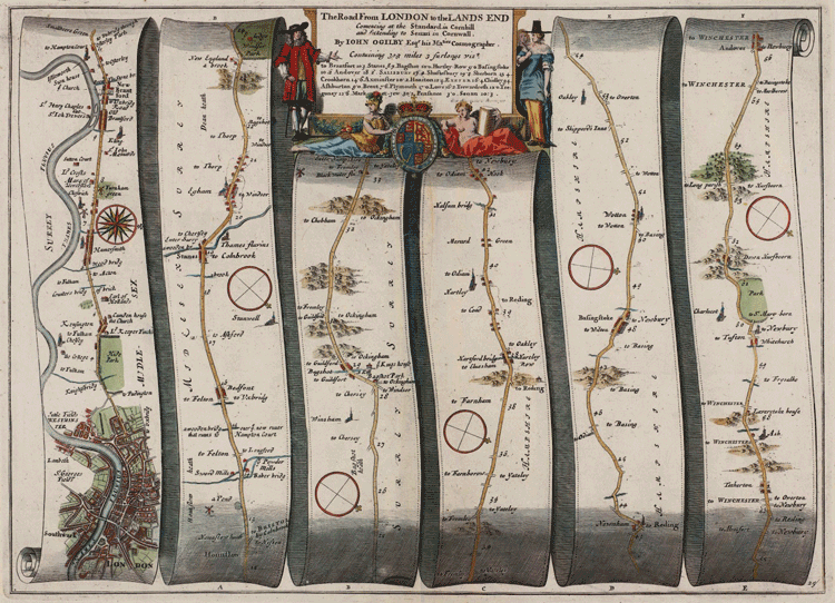
John Ogilby, Creator of the Britannia Atlas
John Ogilby (November 1600 – September 4, 1676) was a Scottish adventurer who, through a series of events, became the official cosmographer and geographic printer for England’s royal family. He was the original publisher of the Britannia Atlas, which was published in the mid-1600s. Much of Ogilby’s work was cartoon-like in nature, animating the cities and legends associated with different parts of England, Europe, and the world.
One of Ogilby’s maps showed the road to London from Andover, England, as it meandered through hills, valleys, and next to rivers and streams. His chart used cartoon graphics to show iconic landmarks on the road to London that could be used by people as they navigated along their way.
Joseph Priestley, Discoverer of Oxygen and Maker of Charts
Joseph Priestley (March 24, 1733 – February 6, 1804) lived during the 1800s in England. He was a member of the clergy, but was also heavily involved in scientific inquiry. Priestley is most commonly known for his discovery of oxygen. He created a series of iconic charts, the most popular of which depicted the lifespans of people in the form of bar charts. In 1769, his chart collection entitled A New Chart of History was an advanced version of a demographic chart collection.
Preistley’s New Chart of History showed the governing bodies of the world and when they reined, including the Russian Empire, Saracens, Turks, the English, and the Persian Empire. The French and the English had major effects on cartographical and demographic knowledge systems, and many of the innovators highlighted in this project come from these two nations.

Alexander von Humboldt, Creator of the First Isothermal Chart
In 1811, Alexander von Humboldt (September 14, 1769 – May 6, 1859) created the French Geographic and Physical Atlas of the Kingdom of New Spain. Of Prussian origin, von Humboldt travelled the world and was the father of modern day geomagnetic and meteorological monitoring. He created Humboldtian science, which was the practice of collecting quantitative data in multiple locations around the world.
Humboldt was the creator of the first isothermal chart, and his work was published around the world. Isothermal charts document temperature over time, and are useful for tracking climate change in different areas of the world during recorded history. Much of our knowledge of past climate is from charts like the ones Humboldt created with the data he gathered during his travels.

Adolphe Quetelet, Charting the Binomial Distribution.
Adolphe Quetelet (February 22, 1796 – February 17, 1874) was from Belgium and highly involved in statistics. Quetelet founded the Brussels Observatory, developed the body mass index scale, helped with founding numerous journals, and put statistical analyses into play in the social sciences. Much like Priestley, Quetelet charted mortality rates based on the seasons when those deaths occurred.
Quetelet may have been the first person to chart the binomial distribution. He used the seasons of the year and mortality rates to create mortality curves, in addition to maps that charted normal curve distributions. Over time, Quetelet helped gather data that backed up the concept of heat causing more homicides.

Charles Joseph Minard, First to Use Pie Charts in Map Format
Charles Joseph Minard (March 27, 1781 – October 24, 1870) amassed a hug collection of data charts and visualizations spanning 300 years of European history. Minard was the first to use pie charts in map format. A French engineer by trade, Minard depicted Napoleon’s retreat from Russia and mapped the movement of people and objects around the world. Minard used his skills as an engineer to bring depth and innovation to the maps he created. He often returned to the maps he had made in the past to update them with new information or by using new cartographical methods.
Charles Joseph Minard’s 1858 quantités de viande used pie charts to visualize the supply of meet to Paris, France.

Overall, DataViz is an interesting resource to use for people who want to learn more about data visualization historically and around the world.
Visit: A History of DataViz