
Propaganda has long been a tool of government and corporations. The use of geography is no exception. Even map projections and emphasizing where places are have been used as a way to influence our ideas. For the last few hundred years, for instance, map projections and maps had often emphasized the Western world (more: Cartographic Anomalies: How Map Projections Have Shaped Our Perceptions of the World). More recently, the Gall-Peters projection, among others, has attempted to rectify this, at least in general textbooks and maps depicting the world. In this case, the correct size of areas, such as along in Africa and the middle latitudes, are shown more correctly. In effect it is a type of equal-area projection.[1]
What is Persuasive Cartography?
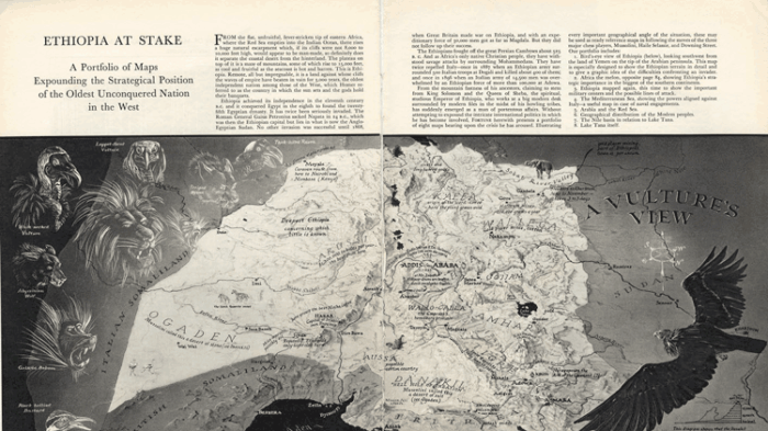
Historically, persuasive cartography has attempted to depict a worldview as believed by ruling powers or the image they attempted to project. Some universities and data repositories have now focused on documenting and collecting historical maps that were used for giving subtle messages about specific concerns. Cornell University Library, for instance, has a repository for such maps. They define persuasive cartography as maps that attempt to influence our beliefs. While it can be argued that no map is completely objective, the range of influence and shaping of our opinions that maps give does have a lot of variety and can cover a range of emotions and beliefs.[2]

Persuasive Cartography During War Times
Well known examples of persuasive geography come from Nazi Germany, for instance, including the Geopolitk school of thought had a major influence on maps made during the 1930s and the World War II years. In the 1930s, for instance, the state of Czechoslovakia was depicted showing how far planes had to fly to reach different parts of Germany, suggesting Czechoslovakia was a threat to Germany. In general, the maps indicated how easily Germany could be encircled by surrounding countries.[3]

Persuasive Cartography in Advertising
While persuasive cartography has been practiced by many states and governments, it is also present in the fields of advertising. For instance, in the 1910s and 1920s, the National Highways Association published maps showing the lack of roads connecting different parts of the US and how that made the US vulnerable in war or places could not be connected to for economic or even leisure purposes. More recently, persuasive cartography has been used by post-Cold War states that attempted to change their perception from being former communist states by reorienting their place or emphasizing their European roots and connections.[4]

This field of persuasive cartography has tried to distinguish the type of cartography from, for example, employed by Nazi Germany and those by less obvious propagandists. In effect, some maps use truthful data but simply emphasize or use subtle means to influence perceptions, while propaganda tends to be more blatant and often misleading.[5] Scholars have also coupled content and other forms of text analysis to see the types of description and discussion that people use to shape how maps are depicted, along with their intent. In effect, the range in which the message is displayed and how it is displayed varies widely from subtle to less subtle approaches that attempt to evoke a variety of emotions.[6]
In recent studies, it was found that rhetorical style was critical to how maps were perceived.[7] For instance, maps that are authoritative, where data was presented as dry and often in overwhelming detail, was seen as more authoritative and accurate, while others that are funny or try to use less scientific descriptions were seen as propaganda, even if the information was generally accurate. In effect, style of presentation has a lot of influence of how people perceive maps. However, an authoritative and highly detailed map could be more prone or useful to be used for propaganda or even persuasive cartography, as perceptions that it is accurate, even when it is not, could be used to persuade people.

While our opinions have often been influenced by maps, often the purpose is for a specific idea or intended belief, which is where persuasive cartography comes in. There is a long historical trend in such maps, but we see that even more recent cartography does not mask its attempts to persuade our opinions.
References
[1] For more on projections and how they inform us about the world, see: John O. E. Clark (ed.) (2015) Maps that changed the world. London, Batsford.
[2] To see the persuasive geography information held by Cornell University Library, see: https://persuasivemaps.library.cornell.edu/about.
[3] For more on this historical example, see: Herb, G.H. (1989) Persuasive cartography in Geopolitik and national socialism. Political Geography Quarterly. [Online] 8 (3), 289–303. Available from: doi:10.1016/0260-9827(89)90043-8.
[4] For more on examples of persuasive cartography and advertising, see: Muehlenhaus, I. (2013) The design and composition of persuasive maps. Cartography and Geographic Information Science. [Online] 40 (5), 401–414. Available from: doi:10.1080/15230406.2013.783450.
[5] For definitions and variations between persuasive cartography and more blatant forms of advertising, see: Zeigler, D. J. (2002) Post-Communist eastern Europe and the cartography of independence. Political Geography, 21(5), 671–686.
[6] For more on the content analysis approach for persuasive cartography, see: Muehlenhaus 2013.
[7] For more on information presentation in maps and how it influences the message from a map, see: Muehlenhaus, I. (2012) If Looks Could Kill: The Impact of Different Rhetorical Styles on Persuasive Geocommunication. The Cartographic Journal. [Online] 49 (4), 361–375.
Related
- Geography of Beliefs
- Zoomorphic Maps: Imagining Maps as Animals
- Maps as People: Anthropomorphic Maps