
How we envision the world is all a matter of perspective. Our worldview has been literally shaped by the way the world has been depicted from our childhoods and into our adulthoods- maps, drawings, infographics, and more all informing how we see the world and the people around us.
The maps and other illustrations of how the world is can be dramatically altered to showcase differing sets of information as Danny Dorling illustrates in this TEDxExeter 2016 talk using cartography from Ben Hennig.
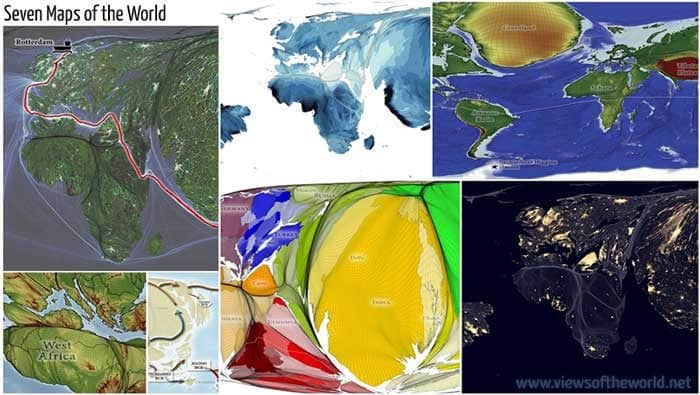
Ben Henning’s Cartographic Inspiration
Looking at the world in a new way is the inspiration behind the cartography of Ben Hennig. Hennig has created a series of maps that depict some of the positive changes the world has undergone.
The project utilized satellite data and information from databases to put together uncommon maps of the world. These maps were built on the basis of everyone in the world being represented equally; that is, everyone on Earth being allotted the same amount of space.
One such map resurrected for Hennig’s purposes was a map of a city that existed nearly 9,000 years ago. In those days cities didn’t look as they do today; there were no roads running through the cities, because people had only recently given up a nomadic lifestyle in order to settle in the safety of a group in one place. Residents walked from rooftop to rooftop to get where they wanted to go, and as cities evolved to be bigger and further apart roads were eventually introduced.
Some of the maps highlighted where population growth and declines have occurred, and where infant mortality has decreased around the world by more than 5% in just one year. More children are living long enough to attend school, find jobs, and attend university.
Humanity’s life span is getting longer, although it is still too short to see many of the changes we undergo over centuries. With these maps we can see where water and food sources exist in abundance, where and when storms occur, and document the changes that occur in different parts of the world on an incredibly accurate scale.
Hennig’s work ultimately sets out to remind people that there is still good in the world, if we want to look for it.
