The population of the Earth has grown and changed long before we were taking scientific records of the development of the human race. The migration of early humans continues to be studied as more and more evidence is discovered that gives us a clearer picture of what life was like hundreds of thousands of years ago.
From then until now humanity has continued to be an extraordinary force on Earth- for better or for worse- and facts and figures about the population are revealed every day.
Here are 10 of the most interesting facts about the world population from the past, present, and what they can mean for the future.
1. Most Populous Countries
The world’s population is approximately 7.2 billion.
The top three most populous nations are China, with 1.4 billion people; India, with 1.3 billion people; and the United States, with approximately 315 million people.
The populations of the United States and the next most populous countries (Indonesia, Brazil, and Pakistan) combined all add up to less than 1 billion people.

2. World Population Increase
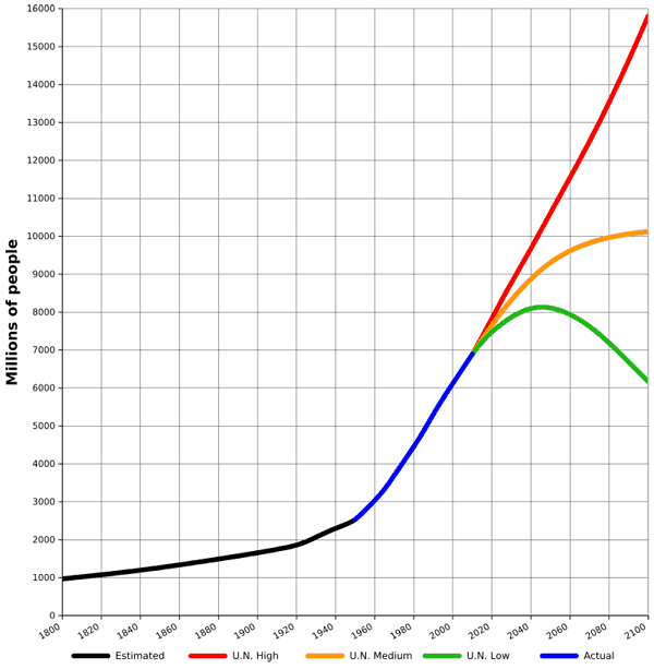
From 1950 to 2010 the global population of the world nearly tripled in size.
The population of Earth has doubled since 1960.
The population of the United States doubled as a result of high birth rates as well as emigration into the country between 1950 and 2010.
By 2050 it is estimated there will be 11 billion people on Earth.
3. People Are Living Longer and Better
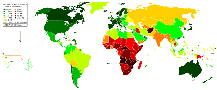
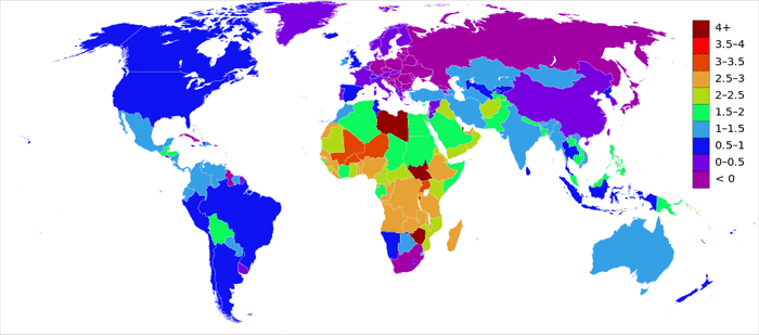
The latest estimate of population growth, or rate of natural increase, was 19.15 in 2012.
Population growth isn’t caused entirely by more people having children, but also by the longer lifespans of individuals seen in many developed and developing nations.
As healthcare, safety, and educational opportunities increase around the world people tend to live longer. The UN estimates that the number of people who will reach 100 years of age will increase 100 times over, from 181,000 people in 200 to over 20 million people in the year 2100.
4. How Women Affect Population Numbers
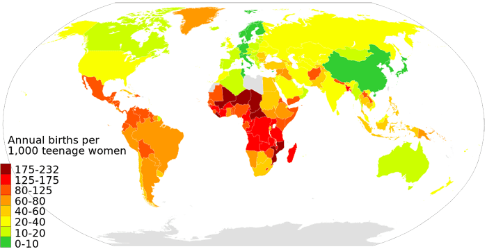
Women, of course, are essential when it comes to the perpetuation of the human race. Women give birth to 100% of the population but are often faced with little to no healthcare options, few educational opportunities, and harsh living conditions.
Compassion International reports that over 14 million girls ages 15-19 become mothers each year but are twice as likely to die from pregnancy related causes than women who are between the ages of 20-34.
Women in developed nations typically reach a higher level of education and are continuing to get married later in life (the average marriage age for a woman in a developed country is around 30 years old), which means they are often having fewer children later, and some not at all.
5. Population Decline In Europe
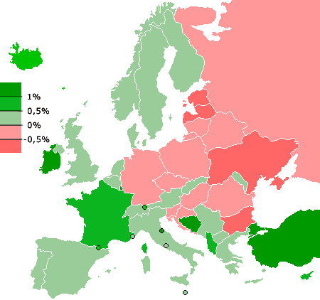
Europe is breaking new ground as the first region in recorded history to see a population decline over the long-term future.
Birth rate decreases and low fertility rates in Eastern Europe and Russia will cause an estimated population decrease from 740 million people in the present day to 732 million people by the year 2050.
6. Overall, the World’s Population is Still on the Rise
Even though population growth has slowed or stabilized in many parts of the globe, the world is still looking at an increase of 80 million people every year. That’s a lot!
7. World’s Population Density
Right now the world’s population density is approximately 120 people per square mile, or 47 people per square kilometer, calculating only the landmass of the Earth (and not the oceans).
These numbers do not take into consideration places like Antarctica, which holds no permanent population of people, or the most inhospitable places in the world like deserts, high mountains, and the greatest flood-prone areas.
Areas of high population density exist because humans crowd around water sources like rivers and coastlines, creating places with high and low population densities.
The highest population density is in Monaco, where about 41,970 people cram into each square mile (16,205 per square kilometer), and the lowest is estimated to be Mongolia with a cozy five people per square mile, two per square kilometer.

8. 11.5 Million Pounds of Food a Minute
According to the Huffington Post and a cool device called the World Food Clock, the world’s population eats 11.5 million pounds of food in just one minute.
When you break it down you realize that while we may be chowing down on 11.5 million pounds in a minute, over half of that ends up wasted.
Factoring in the agricultural expenditures, distribution issues, and cost, we’ve got a major food problem on our hands.
The problem isn’t necessarily how much food the world has- we have enough, for now. Distributing that food from areas that have abundance to areas that don’t is a problem many people and organizations continue to try and find solutions to.
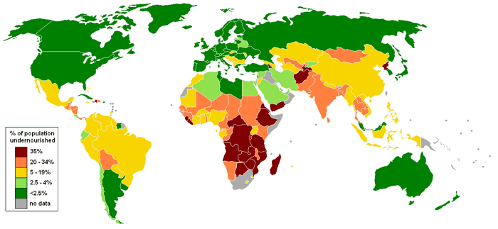
United Nations World Food Programme’s interactive “hunger map”. 2012. Map: Lobizón, MediaWiki Commons, CC BY-SA 3.0
9. Earning Potential of the World
The seven billion people on Earth earn approximately $70 trillion dollars per year, putting the average income of each individual at about $10,000.
Now, we all know people who are making more and who are making less than that. Life food, the average income of people in developed and developing countries in addition to individual countries is hugely disparate.
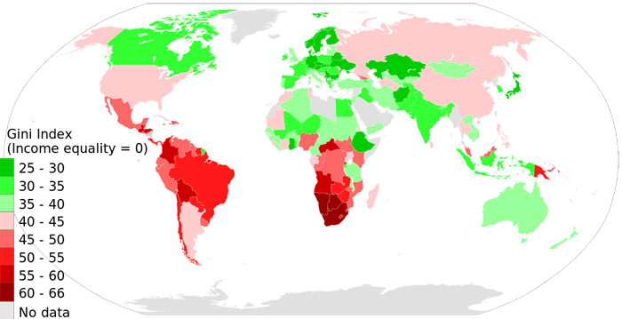
Gini index is a measure of income inequality.
A nation where every individual’s income is equal would have a gini index of 0.
A nation where one individual gets all income, while everyone else gets nothing would have a gini index of 100. Higher gini index for a nation means more income difference between its people.
The average of Gini index scores in this map is about 40. All countries color coded in green have gini index scores less than 40, while those in shades of red have gini index above 40.
10. Planetary Habitability
Even though Earth’s population is estimated to level off and eventually begin declining, there is a point in which Earth will be unable to sustain human life.
The ability of a planet to sustain life is called planetary habitability.
It is estimated that Earth will be able to sustain human life for approximately another billion years or so, but factors like war, climate change and food shortages could wipe us out long before that if we aren’t careful to keep our planet healthy.
The world’s population is made up of individuals just like you and me- unique, interesting, complex creatures living life the best way we can. We are more than just numbers on a fact sheet or pages in a history textbook someday in the future.
While we are here, supported by each other and this wonderful place called Earth, we should be mindful of our impact on the people and planet around us.
References
Compassion International. Population Facts. http://www.compassion.com/poverty/population.htm
Hackett, Conrad. Which Six Countries Hold Half the World’s Population? Pew Research Center. 11 July 2014. http://www.pewresearch.org/fact-tank/2014/07/11/half-the-worlds-population-live-in-just-6-countries/
The Huffington Post. Food for Thought. The World Consumes More Than 11 Million Pounds of Food Every Minute of Every Day. 17 March 2014. http://www.huffingtonpost.com/2014/03/18/world-food-consumption_n_4978947.html
Miniwatts Marketing Group. Internet World Stats. 2012. http://www.internetworldstats.com/stats8.htm
United Nations Department of Economic and Social Affairs. Population Division, Population Estimates and Projections Section. World Population Prospects: The 2012 Revision. http://esa.un.org/wpp/Excel-Data/population.htm
World Atlas. Countries of the World by Highest Population Density. http://www.worldatlas.com/aatlas/populations/ctydensityh.htm
