Firefly cartography is a cartographic style used to create maps that glow. They are characterized by three elements: a dark, de-saturated basemap, a masked highlighted area and vignette, and a single bright thematic area as described by John Nelson.
Although firefly maps are more popular within the ArcGIS ecosystem since it is linked to ArcGIS software, an utmost fascination by this cartographic style has led to a recreation using QGIS. John Nelson describes why this style is more appealing than a normal symbology in this blog.
Preparation
The dataset used for this visualization can be found here. To follow along with this short tutorial, please store the dataset on to your computer.
- For the basemap, we will use the wb_countries_admin0_10m accessed from https://datacatalog.worldbank.org/.
- For the second data we will use the World Cities which have been derived from 2 different datasets. A 2015 population data accessed from worldometer and a world cities data from a colleague.
If you are new to GIS, you can install QGIS software using this link provided.
Adding Data into QGIS
The first thing we do is add the dataset into the QGIS workspace. There are multiple ways to do this, for this project we use the add layer tool in the Layer menu bar.
Click on Layer -> Add Layer ->Add Vector Layer(since we are working with vector data) -> Navigate to where the data is on your computer -> Add.
We do this with the two datasets.

STYLING THE BASEMAP
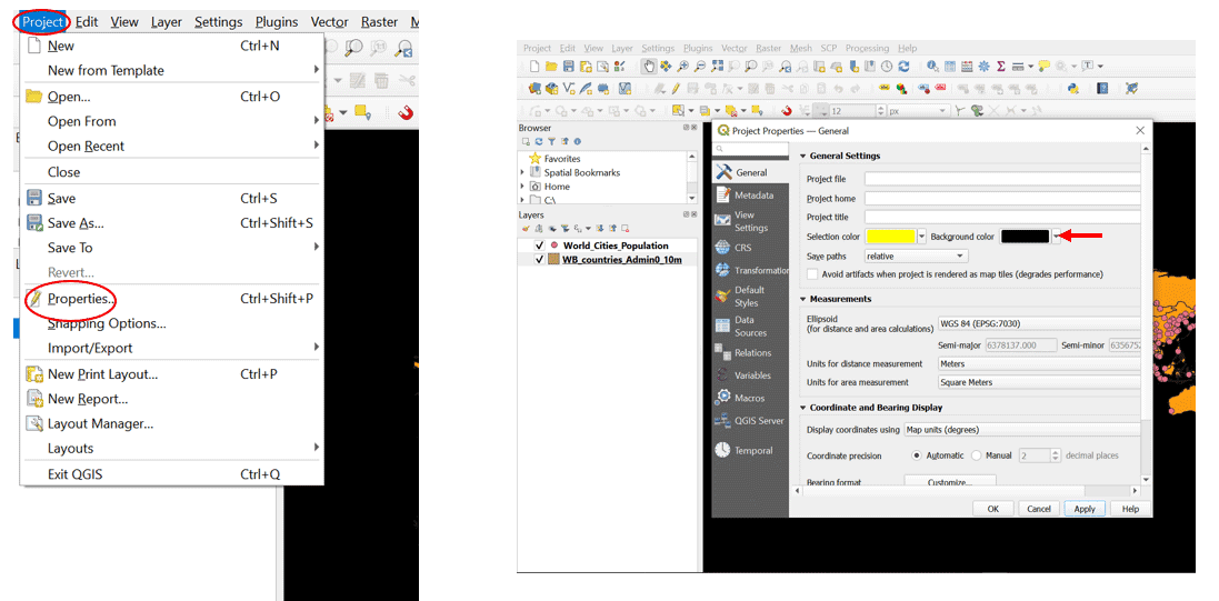
A firefly basemap is expected to be dark and devoid of color, according to John Nelson. Before we do this, we will set the mapview to be dark so there can be enough contrast for the styling. Project -> Properties ->Background color -> Black.
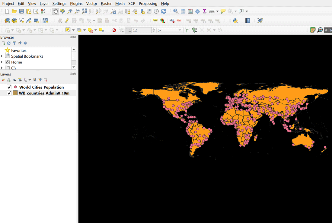
The resulting map view will now look like this:
Styling the basemap
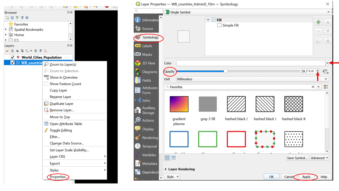
To style the basemap, right click on the Wb_countries_admin_10m -> Properties ->Symbology-> Color -> Opacity.
We set the color to white and opacity can be set based on preference.
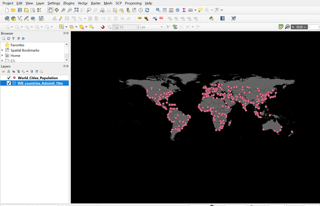
The country base layer is now set to white with an opacity of 40% and looks like this:
Creating the Firefly Effect
For this, we will use the World Cities data. First, we need to create a graduated symbol to represent our data. We do this so we can show the quantitative difference of population between different cities.
Right click on World_Cities_Population -> Properties ->Symbology-> Set to Graduated -> Set the value to csvData_Po ->Classes -> Classify->Edit the Values and Legend by double clicking ->Apply
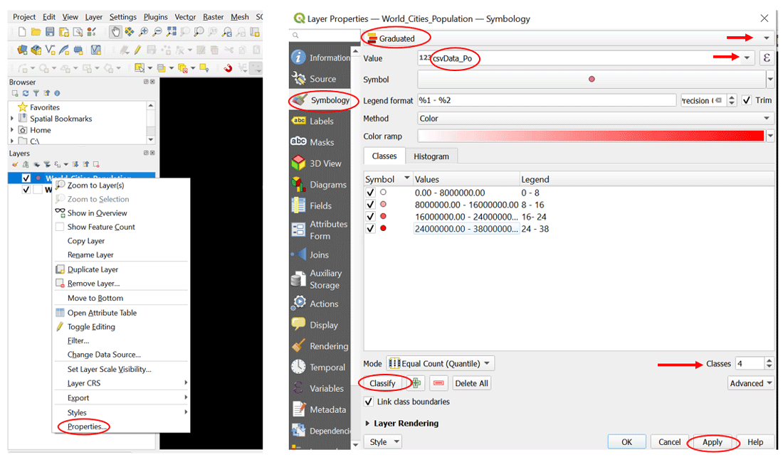
The layers in QGIS with the city populations layer styled with graduated symbols now looks like this:

Creating the glowy effect
Then we style the individual values from the previous step with the glowy effect.
Double click on any of the value (for me I did the first) -> Double click on Simple Marker -> Set size -> We use transparent fill for the stroke color ->
Scroll down on the same window and check the draw effects tool

The data layers now look like:

Then we set the effect properties by clicking on the star symbol.
Check Outer Glow-> Set the Spread, Blur Radius, and Opacity-> Change the color -> Ok.
You can explore more effect (inner glow, inner shadow, drop shadow) properties.
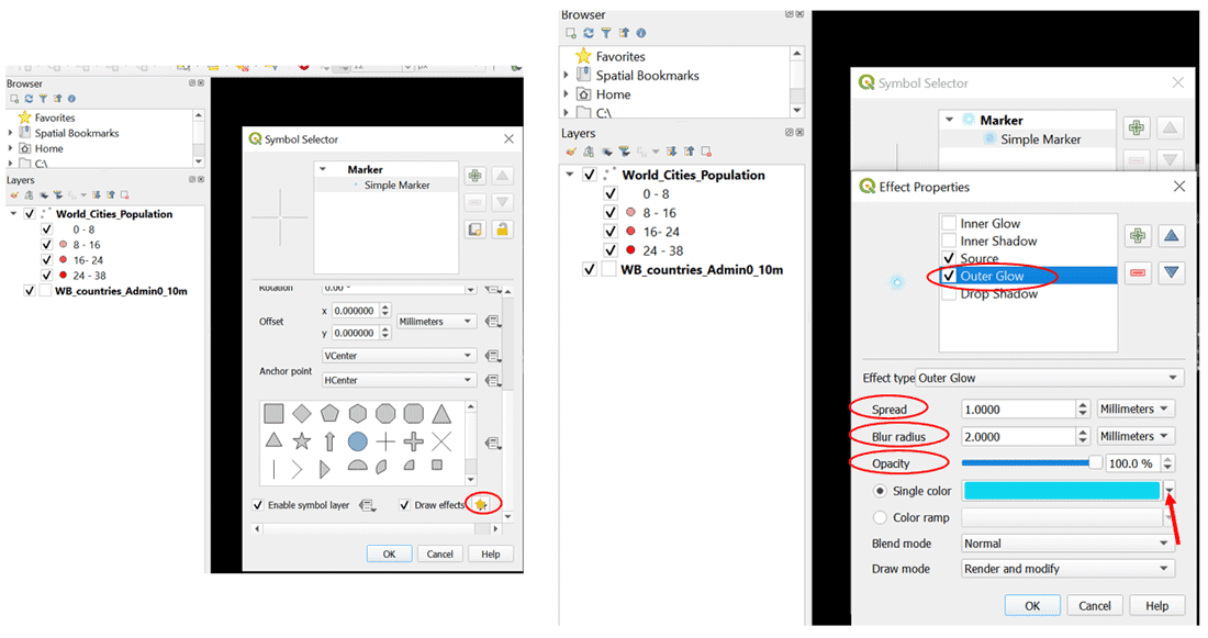
The world cities population layer now has a blue glow.

We apply the same steps on the other 3 values.
Final Map in QGIS
For my final map in QGIS, I used the same color but varied the size of the symbol.

Thank you for following along, I hope this has been helpful.
About the author
Omowonuola Akintola is a Co-Host with the Africa Geoconvo Podcast which discusses geospatial innovation in Africa.
You can connect with her on LinkedIn or via email.
Resources
Royé, D. (2021, June 1). Firefly cartography. Dr. Dominic Royé. https://dominicroye.github.io/en/2021/firefly-cartography/
Firefly Cartography: A Vehicle for Tricking Normal People into Wanting to Make Maps. (n.d.). Esri Story Map. https://nation.maps.arcgis.com/apps/Cascade/index.html?appid=bf439954e2b64d418aedd2fe11217d83
Steal this firefly style please. (2018, May 30). ArcGIS Blog. https://www.esri.com/arcgis-blog/products/mapping/mapping/steal-this-firefly-style-please/
