
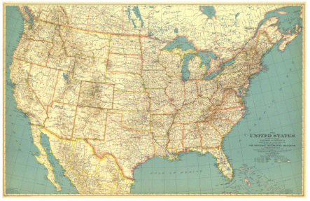
The National Geographic Society is renowned in part for its stunning maps, each labeled in incredible detail. The distinctive lettering on National Geographic’s maps is know for its detail and legibility, even with the smallest sized fonts.
In the 1930s, the National Geographic Society’s Cartographic Division began to look at automating typefaces for its map production. Until the early thirties, labeling on maps was done by hand, a very labor intensive process. Chief Cartographer, Albert H. Bumstead began experimenting with photographic type. After much trial and error, Bumstead invented a machine that composed map type photographically without degradation in legibility when enlarging or reducing the map size.
The May 1933 National Geographic edition’s United States map supplement was the first to apply this new photolettering process.
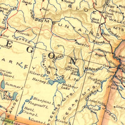
In 1923, the National Geographic Society hired English cartographer Charles Ernest Riddiford to its Cartographic Division. Following Bumstead’s development of a process for using photolettering on maps, Riddiford developed a new map typeface with a higher photomechanical reproductive quality than the previous typefaces in use by the National Geographic Society for its maps. The typeface set was adopted by the National Geographic Society for all of its maps and is still in use today.

Riddiford wrote about the importance of typefaces in cartography in his article “On the Lettering of Maps” published in the journal The Professional Geographer (Volume 4, Issue 5, pages 7–10, September 1952) writing:
I remember many years ago a friend of mine being handed a certain book to read. He opened it, took one look at the page, then handed it back. “No,” he said “can’t read it, don’t like the type.” There are those, no doubt, who feel equally sensitive about the lettering of a map.
Riddiford remained with National Geographic until his retirement in 1959 as its chief research cartographer. Riddiford died at the age of 71 in 1968 (Washington Post, May 15, 1968, p.B10).
I feel the same way about type!
I’ve always been partial to specimen 67342. Note how they even set the attribute information in the table to the typeface in that row. Clever chart. Do you know if it’s available somewhere in higher resolution?
Thanks, Caitlin!