This section of the free chapter preview of Mastering QGIS looks at styling vector and raster GIS data in QGIS. Mastering QGIS is designed to bring users who want to go beyond the basics of QGIS to an advanced level of QGIS expertise.
When you load spatial data layers into QGIS Desktop, they are styled with a random Single Symbol rendering. To change this click on Layer | Properties | Style.
There are several rendering choices available from the menu in the upper left corner:
- Single Symbol – this is the default rendering in which one symbol is applied to all the features in a layer.
- Categorized – allows you to choose a categorical attribute field to style the layer with. Choose the field, and click Classify and QGIS will apply a different symbol to each unique value in the field. You can also use the Set column expression button to enhance the styling with a SQL expression.
- Graduated – allows you to classify the data by a numeric field attribute into discrete categories. You can specify the parameters of the classification (classification type and number of classes) and can use the Set column expression button to enhance the styling with a SQL expression.
- Rule-based – use this to create custom rule based styling. Rules will be based on SQL expressions.
- Point displacement – if you have a point layer with stacked points, this option can be used to displace the points so they are all visible.
- Inverted polygons – this is a new renderer that allows a feature polygon to be converted into a mask. For example, a city boundary polygon used with this renderer would become a mask around the city. It also allows for use of Categorized, Graduated and Rule-based renderers and SQL expressions.

Above, the renderers is the layer symbol. For a given symbol you can work with the first level which gives you the ability to change the transparency and color. You can also click on the second level which gives you control over parameters such as: fill, border, fill style, border style, join style, border width and X/Y offsets. These parameters change depending upon the geometry of your layer. You can also use this hierarchy to build symbol layers which are styles built from several symbols combined vertically.
Styling Raster Data
You also have many choices when styling raster data in QGIS Desktop. There is a different choice of renderers for raster data sets:
- Singleband gray – allows a singleband raster, or a single band of a multiband raster, to be styled with either a black-to-white or white-to-black color ramp. You can control contrast enhancement and how minimum and maximum values are determined.
- Multiband color – this is for rasters with multiple bands. It allows you to choose the band combination you prefer.
- Paletted – this is for singleband rasters with a color table included. It will likely be chosen by QGIS automatically if this is the case.
- Singleband pseudocolor – this allows a singleband raster to be styled with a variety of color ramps and classification schemes.

Contrast Enhancement
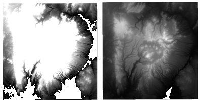
Another important consideration with raster styling are the settings used for contrast enhancement when rendering the data. Let’s start by loading the Jemez_dem.img and opening the Layer Properties | Style menu. This is an elevation layer and the data are being stretched on a black to white color ramp from the Min and Max values listed under Band rendering. By default these values only include those that are from 2% to 98% of the estimation of the full range of values in the data set and are cutting out those outlying values. This makes for faster rendering but not necessarily the most accurate.

Next you will change these settings to get a full stretch across all the data values in the raster.
- Under Load min/max values choose Min / max and under Accuracy choose Actual (slower).
- Click Load.
- Notice that the minimum and maximum values change.
- Click Apply.

You can specify the default settings for rendering rasters by opening Settings | Options | Rendering. Here the defaults for Contrast enhancement, Load min/max values, Cumulative count cut thresholds, and the Standard deviation multiplier can be set.
Blending Modes
These allow for more sophisticated rendering between GIS layers. Historically, these tools have only been available in graphics programs and they are a fairly new addition to QGIS. Previously only layer transparency could be controlled. There are now 13 different blending modes available: Normal, Lighten, Screen, Dodge, Addition, Darken, Multiply, Burn, Overlay, Soft light, Hard light, Difference, and Subtract. These are much more powerful than simple layer transparency, which can be effective, but typically results in the underneath layer being washed out or dulled. With blending modes you can create effects where the full intensity of the underlying layer is still visible. Blending mode settings can be found at the bottom of the Layer Properties | Style menu in the Layer Rendering section along with the Layer transparency slider. They are available for both vector and raster datasets.
In this example of using blending modes we want to show vegetation data (Jemez_vegetation.tif) in combination with a hillshade image (Jemez_hillshade.img). Both data sets are loaded, and the vegetation data is dragged to the top of the layer list. Vegetation is then styled with a Singleband pseudocolor renderer as follows:
- Choose Random colors
- Set Mode to Equal interval
- Set the number of Classes to 13
- Click Classify
- Click Apply

At the bottom of the Layer Properties | Style menu set the Blending mode to Multiply and the Contrast to 45 and click Apply. The blending mode allows all the detail of both data sets to be seen. Experiment with different blending modes to see how they change the appearance!

<– Previous: Editing Data in QGIS ~ From Mastering QGIS ~ Next: Composing Maps in QGIS –>
