
In 2016, kepler.gl, Uber’s mapping tool used to track and map journeys on its popular ride hailing application, was released as an open source project by the company. Since then, its utility and application has expanded to different areas, often used as a powerful map and data visualization tool that is surprisingly relatively easy to use.
What kepler.gl [1] does is it enables web-based visualization of large-scale spatial data to be relatively seamless.
Various spatial data, that tracks movement or where requests for rides are made, are among the many ways in which data can be selected, with different visualization options available. This includes heat maps, line maps, multi-layered maps, and many others.
The open source nature of the project has attracted many other companies to use the application and expand its use to their own data needs, with such companies as Mapbox, Airbnb, and Alphabet among its users.
Not only is the application relatively easy to use, but another key advantage of the platform is that it can provide complex and informative visualization using a massive amount of data, making it a stable and useful for companies interested in ‘big data’ visualization and mapping.[2]
The application advertises itself as data agnostic, being built on deck.gl, which is a WebGL-powered library containing many tools for handling large data visualization. Additionally, react-map-gl is also part of the tool to give it additional visualization capability, with these tools integrated together by Uber’s data visualization team.
In kepler.gl, visualization in different maps can be quickly achieved by simply dragging and dropping data, such as from a .csv file, and then trying different forms of data visualization. Geometry calculations are GPU-acellerated, allowing faster processing of visual and large amounts of data.
Mapping builds on Uber’s hexagon-based grid mapping, with isometric perspective views given. Maps can be recorded to play back data visualization.[3]

Novel research has also developed around kepler.gl.
For instance, in Japan, the application has been used to help warn people of potential heatstroke. Using the Internet of Things, weather data, and heartbeat data can be obtained and combined with location information on kepler.gl’s application, allowing real-time information to inform if a person is more likely to have a heatstroke in a given location and weather conditions. The benefit of kepler.gl is that it can obtains millions of data points and multiple information to give a more specific, tailored probability estimate of an event like heatstroke occurrence for users of the application.[4]
Another novel application is real-time population displacement from major disasters such as hurricanes. Using phone data location information, it was possible for researchers to map how populations dispersed as Hurricane Harvey hit southern Texas. Here, kepler.gl performed as a visualization tool that made it easier to display the large population set that moved around as the hurricane made its way to land.[5] Future research can utilize this information to better prepare for evacuations.
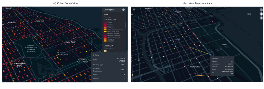
Other applications also include visualizing population data for predicting crime and where it may occur based on social media data gathered.[6]

We think of Uber as a taxi-hailing application but the application has fostered a large amount of data that has been captured and visualized by its mapping technologies.
Among these tools is kepler.gl, which now is being used by not only many companies but also researchers attempting to visualize and spatial understand large data problems, ranging from disaster preparation to health and welfare benefits.
Video: Exploring large-scale geospatial data on the web with Kepler.gl
Presentation by Uber Data Visualization’s Shan He

References
[1] Accessing kepler.gl can be found here: https://kepler.gl/
[2] For more on users and applications of kepler.gl, see: https://hub.packtpub.com/ubers-kepler-gl-an-open-source-toolbox-for-geospatial-analysis/.
[3] For more insight into kepler.gl, see: https://eng.uber.com/keplergl/
[4] For more on the use of Kepler.gl for mapping probabilities of heatstrokes, see: Matsui, K., Sakai, K., 2020. A Proposal for a Dynamic Digital Map to Prevent Heatstroke Using IoT Data, in: Barolli, L., Takizawa, M., Xhafa, F., Enokido, T. (Eds.), Advanced Information Networking and Applications. Springer International Publishing, Cham, pp. 1205–1216. https://doi.org/10.1007/978-3-030-15032-7_101.
[5] For more on the use of Kepler.gl for visualizing phone location data and Hurricane Harvey’s impact on southern Texas’ population, see: Marzuoli, A., Liu, F., 2018. A data-driven impact evaluation of Hurricane Harvey from mobile phone data, in: 2018 IEEE International Conference on Big Data (Big Data). Presented at the 2018 IEEE International Conference on Big Data (Big Data), IEEE, Seattle, WA, USA, pp. 3442–3451. https://doi.org/10.1109/BigData.2018.8622641
[6] For more on application related to crime prediction/forecasting, see: Morshed, A., Forkan, A.R.M., Tsai, P.-W., Jayaraman, P.P., Sellis, T., Georgakopoulos, D., Moser, I., Ranjan, R., 2019. VisCrimePredict: a system for crime trajectory prediction and visualisation from heterogeneous data sources, in: Proceedings of the 34th ACM/SIGAPP Symposium on Applied Computing – SAC ’19. Presented at the the 34th ACM/SIGAPP Symposium, ACM Press, Limassol, Cyprus, pp. 1099–1106. https://doi.org/10.1145/3297280.3297388