
Maps and Cartography
Maps and cartography are essential tools in geography that enable us to visualize and understand the Earth’s surface and its features.
Cartography is the art and science of creating maps, which involves the use of sophisticated technology and techniques to accurately represent the Earth’s physical and cultural features.
Maps provide a visual representation of the world, allowing us to identify patterns, explore spatial relationships, and navigate through unfamiliar terrain.
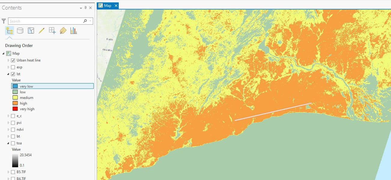
How to Use ArcGIS Pro to Map Urban Heat Islands
This ArcGIS Pro tutorial demonstrates how to assess urban heat in a region.

Survey Markers and Benchmarks
Benchmarks are a type of survey markers whose elevations have been surveyed as accurately as possible based on the technology at the time.

Robinson Map Projection
The Robinson map projection is a compromise project that minimizes distortion across the map.

Datacubes in GIS
Increasingly, Earth observation (EO) data are stored as datacubes, helping to assist the analytical process.

Deepfake Satellite Imagery
Deepfake satellite imagery is imagery that has been synthetically to alter or change the appearance of an image, often replacing one scene for another.

3 Tips to Maximize the Value of Your GIS Internship
Andres Abeyta, the Executive Director of Bootcamp GIS, discusses three ways to get the most of your GIS internship.

Mapping Schools with Artificial Intelligence
Researchers are using AI to map schools in countries where many schools are undocumented so as to connect children with schools.

What Was the First Map Issued by the Ordnance Survey?
The first Ordnance Survey map was issued in 1801.

How Maps Affect Perception
Maps are both a great tool for telling us an important message but they can also be a key part of false narratives or misleading information.

Using GIS to Create a Vaccination Route Modeling Tool
NHS South, Central and West CSU has developed the new bespoke Covid-19 vaccination route modeling tool using Esri's GIS.

How Black Cartographers Highlighted Injustice
The work of the Black Panther Party, a 1960s- and 1970s-era Black political group featured in a new movie and a documentary, helps illustrate how cartography can illuminate injustice.

Mapping Forest Carbon Cycles
A recent research project uses geospatial technologies as a way to better assess the role that forests play in the global carbon budget.

Ten Reasons Why Spatial Data Quality Matters More Now Than Ever
Geographer Josephy Kerski writes about 10 key reasons why geospatial data quality matters.

What is a Cartifact?
A cartifact is an object containing a map that is used primarily for design rather than as a source of information.

Using Stingrays to Map the Ocean Floor
One research lab in Japan is looking at using marine life to collect 3D geospatial data about the ocean floor.

New Developments in UAVs
2021 promises new changes that are set to shakeup UAVs and their use in future years.

WebGIS Section 3: Architecture
Emmanuel Jolaiya explains the architectural workflow of a WebGIS.

Automatic and Efficient Data Logging of Weed Management Activities
Harley Schinagl, the developer of STA logger, write about how this geospatial hardware is designed for conservation and land management fields.

Review | The Eternal City: A History of Rome in Maps
When you finish this delight of a book, you feel that the history of the mapping of Rome can stand as the very paradigm of the history of pre-digital cartography itself.

Review: Time in Maps
Time in Maps is a sumptuously-illustrated large-sized book that serves as a celebration of the development of GIS.

WebGIS Section 1 – A Quick Introduction to GIS and WebGIS
In section 1 of this series on WebGIS, Emmanuel Jolaiya provides readers with an overview of GIS and WebGIS.
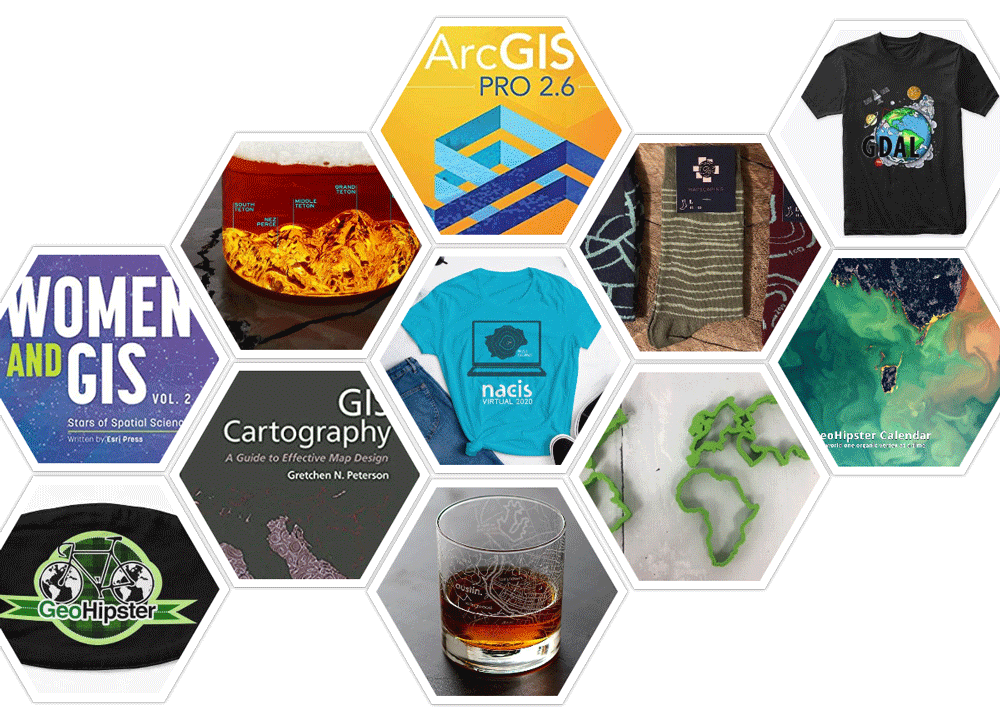
2020 Gift Guide For the GIS Person in Your Life
Looking for a gift for your favorite GIS person? Here's a list of geo-related suggestions for a range of budgets.

New “Map Projections for Babies” Board Book Helps Encourage Early Communication and Learning
Dan Ford explains how support from the geospatial community will help bring the "Map Projections for Babies" board book to life.

How to Create Public Transport Isochrones in ArcGIS Pro
This tutorial shows GIS users how they can create public transport isochrones using ArcGIS and the TravelTime plugin.

How to Communicate with Maps
Making maps requires a careful balance between science, art, and knowledge of your target audience. Features a MapScaping podcast with Esri's John Nelson.