Visualizing spatial data in R is oftentimes more challenging than it initially seems. There’s a ton of moving parts, like map center point, zoom, map type, marker size, and so on. And then there’s cartographic design and managing aesthetic appeal along with the functional elements. It goes without saying, but you have to get all of them right to have a cohesive map.
That’s where this article comes in. We’ll show you how to build interactive Google Maps with R, and how to include them in R Shiny dashboards. With Google Maps in R, you can give your users a familiar map and retain customizability by placing it within a Shiny dashboard.
To follow along, you’ll have to set up a Google Cloud account. It’s fairly simple, but we’ll show you how.
Looking for a Google Maps alternative? Check Appsilon’s guide on building interactive maps with R and Leaflet.
How to Set up a Google Cloud Account
As the name suggests, Google Maps are developed by Google and offered as an API through their Cloud Platform. You’ll have to register an account and set up billing.
Once you have an account and a project setup, you can enable APIs required for communication between R and Google. These are:
- Maps JavaScript API
- Maps Static API
- Geocoding API
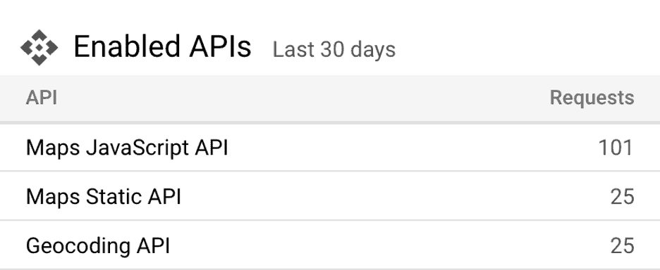
To enable them, click on the menu icon, go under APIs & Services and click on Library. You can search for the APIs from there and enable all three. Once done, you’ll see them listed on the main dashboard page:

Yours should show zeros under Requests if you’re setting up a new Google Cloud account. The final step is to create a new API key. Go under Credentials and click on + Create credentials to get a new API key:

Once created, copy the string code somewhere safe. You’ll need it in the following section, where you’ll create a couple of interactive Google Maps with R.
Build Interactive Google Maps with R
You’ll need the googleway library to follow along, so make sure to have it installed. Dataset-wise, you’ll use the US airports dataset from Kaggle:

Copy the following code snippet to load in the library and the data — don’t forget to change the working directory and the API key:
setwd("<your-dataset-directory>")

library(googleway)
api_key <- "<your_api_key>"

data <- read.csv("airports.csv")
head(data)
Here are the first six dataset rows:

The dataset has everything needed for map visualization. Latitude and longitude are generally everything you need, but you’ll see how the additional columns can make the map richer.
Basic interactive Google Map with R
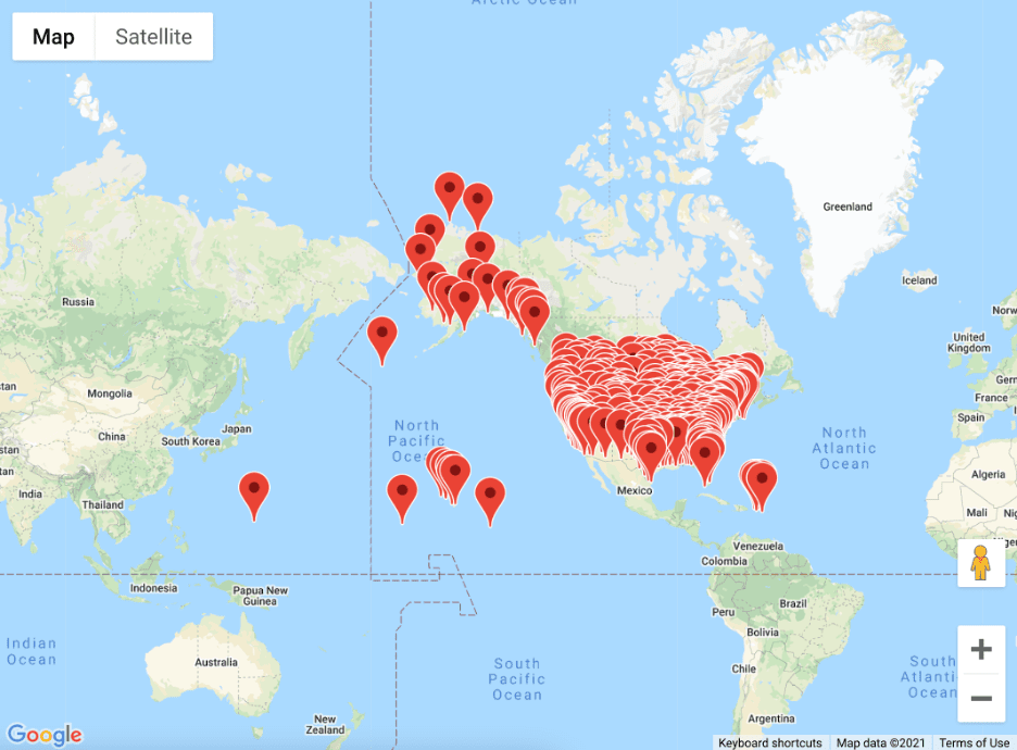
Let’s start with the basics. We’ll add markers to every latitude and longitude combination from the dataset. You can use the google_map() function from googleway package to specify the API key and the dataset, and then call the add_markers() function to add the points:
map <- google_map(
  key = api_key,
  data = data
)
map %>%
  add_markers(lat = "LATITUDE", lon = "LONGITUDE")
<script src=”https://gist.github.com/darioappsilon/4101ce35b385a9fbd9cce8eae5c200df.js“></script>

There are many built-in options you don’t have to worry about. You can zoom in, zoom out, change the map type, and even use Google Street View! You can also tweak how the markers look like. We’ll explore how, next.
Change marker color in Google Maps
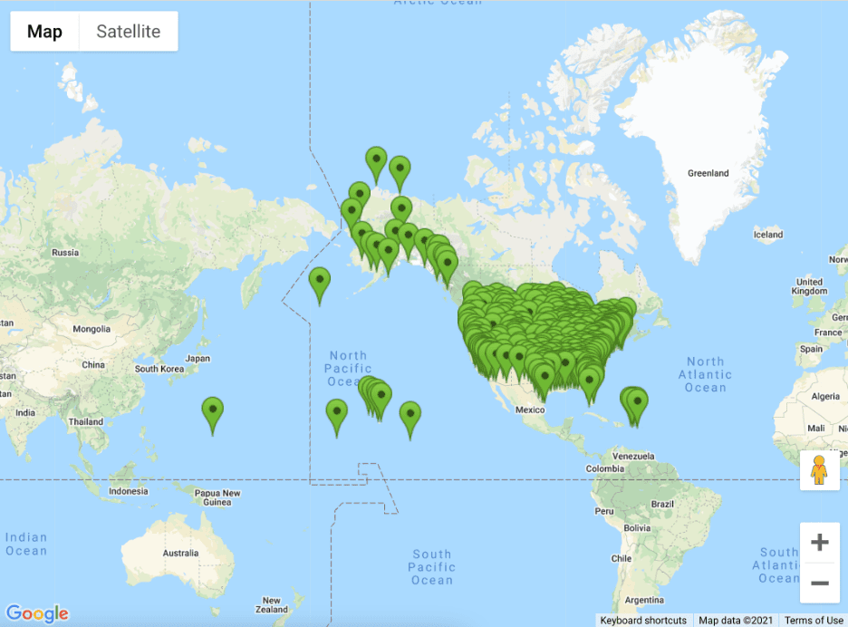
The googleway library is quite restrictive with marker colors. You can go with red (default), blue, green, or lavender. To make matters worse, the package requires an additional column in the dataset for the color value. It’s useful if you’re using some conditional logic to color the markers, but a complete overkill if you aren’t.
data$COLOR <- "green"
map <- google_map(
  key = api_key,
  data = data
)
map %>%
  add_markers(lat = "LATITUDE", lon = "LONGITUDE", colour = "COLOR")

Long story short, you’re quite limited in color selection if you’re using google way to build interactive Google Maps with R.
Add mouse over effect to Google Maps
Adding mouse over effect to your interactive Google Maps with R is strongly advised if you want to make maps users will love. The mouse over effect represents what happens as the user pulls the mouse cursor over a marker.
The code snippet below shows you how to add an airport name, stored in the AIRPORT column:
map <- google_map(
  key = api_key,
  data = data
)
map %>%
  add_markers(lat = "LATITUDE", lon = "LONGITUDE", mouse_over = "AIRPORT")

Mouse over effect can become a nightmare if your map has many markers, or if there’s almost no spacing between them. If that’s the case, you might want to consider info windows instead.
Add info window to Google Maps
Unlike mouse overs, info windows will activate only if the user clicks on a marker in your interactive map. Keep in mind — the info window also has to be closed manually by the user.
To spice things up, we’ll add an additional column that contains the airport name, city, and state. You can add and customize yours easily with the paste0() function.
data$INFO <- paste0(data$AIRPORT, " | ", data$CITY, ", ", data$STATE)
map <- google_map(
  key = api_key,
  data = data
)
map %>%
  add_markers(lat = "LATITUDE", lon = "LONGITUDE", info_window = "INFO")

It’s hard to tell if info windows are better than mouse overs for this dataset, as markers aren’t packed extremely tightly. Go with the one that feels more natural.
You now know the basics of interactive Google Maps with R and googleway. Next, you’ll see how to embed them to an R Shiny dashboard.
Add Interactive Google Maps to R Shiny Dashboards
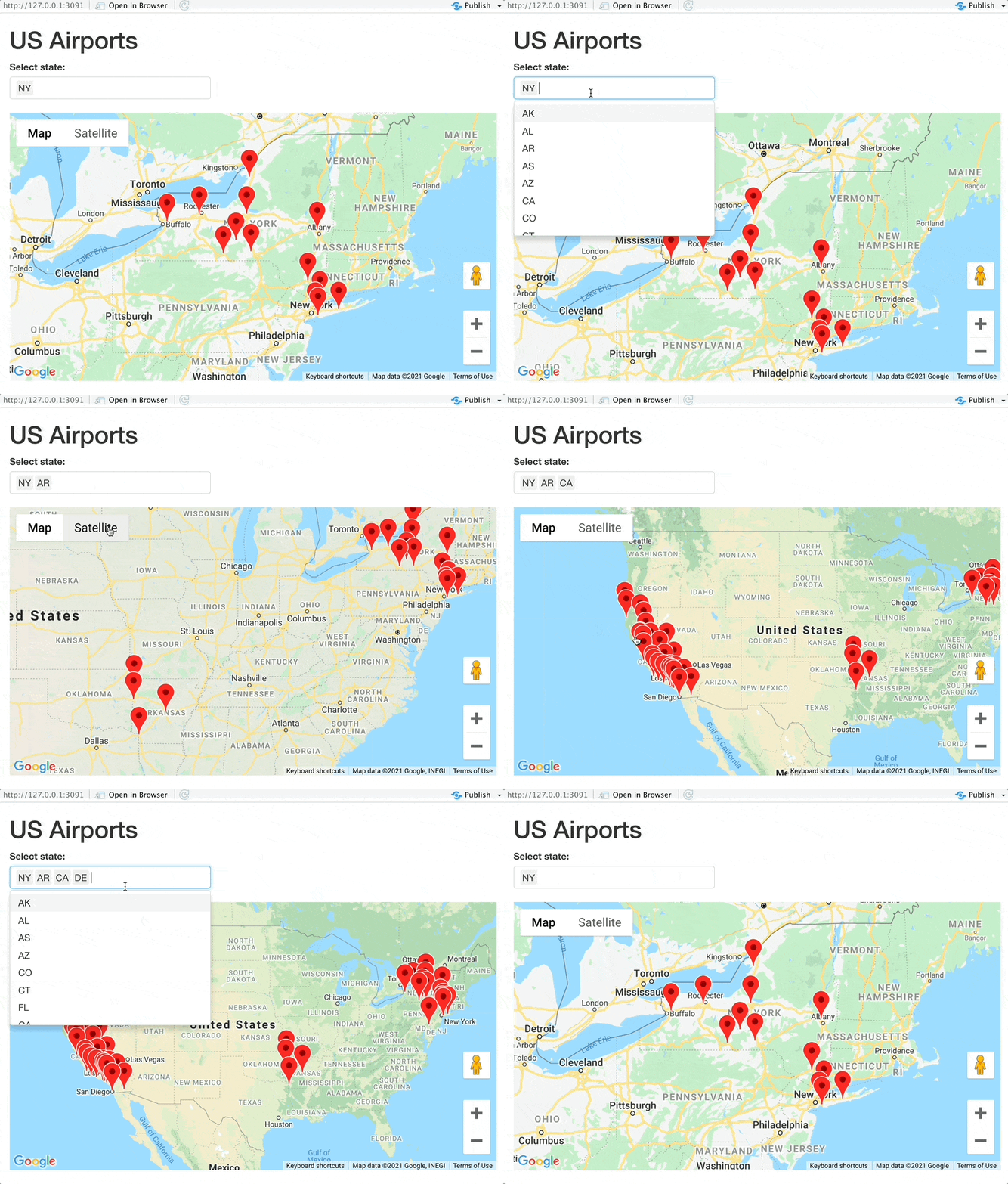
You’ll now see how easy it is to add interactive Google Maps to R Shiny dashboards. The one you’ll see below allows the user to specify a list of states from which the airports are displayed.
Keep in mind:
- App UI — You can use the google_mapOutput() function as a placeholder for the interactive Google map.
- App Server — Use the renderGoogle_map() function to display the map. The data is prepared earlier as a reactive component to match the user-selected states and display the airport, city, and state info on mouse over.
Here’s the entire code:
setwd("<your-dataset-directory>")

library(shiny)
library(dplyr)
library(googleway)

api_key <- "<your-api-key>"
airports <- read.csv("airports.csv")

ui <- fluidPage(
  tags$h1("US Airports"),
  fluidRow(
    column(
      width = 3,
      selectInput(inputId = "inputState", label = "Select state:", multiple = TRUE, choices = sort(airports$STATE), selected = "NY")
    ),
    column(
      width = 9,
      google_mapOutput(outputId = "map")
    )
  )
)

server <- function(input, output) {
  data <- reactive({
    airports %>%
      filter(STATE %in% input$inputState) %>%
      mutate(INFO = paste0(AIRPORT, " | ", CITY, ", ", STATE))
  })
  output$map <- renderGoogle_map({
    google_map(data = data(), key = api_key) %>%
      add_markers(lat = "LATITUDE", lon = "LONGITUDE", mouse_over = "INFO")
  })
}

shinyApp(ui = ui, server = server)

The googleway library configures the location and the zoom level automatically for you. The map was zoomed to New York by default and changed instantly when we added more states. Overall, we have a decent-looking map for 30-something lines of code.
The questions left to address are the speed and the looks. Luckily, we have dedicated articles on these topics, written with having R Shiny dashboards in mind:
These two are excellent reads if you’ve enjoyed this article, as they allow you to take your R Shiny dashboards to the next level.
Conclusion
And there you have it — How to build, tweak, and style interactive Google Maps with R. You’ve learned a lot today, but there’s always room to improve. Here are a couple of challenges you can do next:
- Use custom icons instead of the default markers
- Show airports as a heat map instead of markers
- Calculate distances between airports using the Google Maps API
Reference the official documentation if you decide to work on these challenges. And feel free to share your results with us – @appsilon. We’d love to see what you come up with.
If you’re looking for a faster way to showcase your map online, check out our Shiny Dashboard Templates. They’re free to use and a great launching point for your project.
About the Author
Dario Radečić, is a data scientist and R enthusiast. He is a part-time data storyteller at Appsilon with numerous articles on R programming and other data science topics. You can explore some of his works here [https://appsilon.com/author/dario/].
