
Air pollution occurs when harmful substances are released into the atmosphere, that affects the health of humans, other living organisms, and the environmental climate. These harmful substances may come as gases like carbon dioxide, ammonia, methane, chlorofluorocarbons, among many others, from sources like household combustion devices, motor vehicles, industries, forest fires, among many others.
Air pollution can lead to diseases, allergies, and even death of humans.
What is clean air?
According to air quality activists, dry clean air should make up 78% nitrogen, 21% oxygen, and 1% other gases like argon, carbon dioxide, methane, hydrogen, helium, and more.
Air pollution
Air pollution alters the ideal clean air composition approved by air quality professionals. According to World Health Organization (WHO), 99% of the world population breathes air that exceeds the air quality index approved by WHO and contains high percentage of air pollutants, with low income and middle income nations suffering the most.
One major subject that affects climate change is air pollution. Many of the actors of air pollution also cause greenhouse gas emissions.
Therefore, well-informed strategies and policies on air pollution provides a two-way mitigation for climate and health by lowering risks of diseases made available by air pollution as well as contributing to the short and long term mitigation of climate change.
The advent of geospatial tools and technologies has provided a way of addressing air pollution that supports the many anti-air pollution strategies. This GIS tutorial outlines how to use ArcGIS Pro to map air pollution using data from the United States Environmental Protection Agency.
The figure below shows a summary of the methodological flow of the several geospatial tools employed in the study.

Accessing and cleaning air pollution Excel data

- Access the “Download Daily Data” from the U.S. Environmental Protection Agency’s website.
- From the web interface, set pollutant to “atmospheric particulate matter (PM 2.5)” and year to “2018.”
- Set geographic area to your desired US State and select “Get Data.”
- Click “Download CSV Spreadsheet.”
- Open the .CSV air quality Excel data. For the purposes of this tutorial, information on Daily mean PM 2.5 information, Daily AQI value, site name, site longitude, and site latitude will be of interest.
To prepare the data for use in the ArcGIS Pro environment, follow the steps outlined below;
- Select the “Site Name” column, click the “Data” tab and select “sort A to Z” to sort names from A to Z.
- Click Sort.

After sorting, we will classify the data in Excel based on “Site Name” by selecting our columns of interest.
During the classification process, the average of daily Air Quality Index (AQI) and PM values are estimated to represent their yearly information.
- Select all the data in Excel. From the Data tab, select “subtotal.”
- Set “At each change in” option to Site Name and “Use function” to Average.
- From the “Add subtotal to:” tab, select Daily AQI, Daily PM 2.5, Site Longitude, and site latitude.
- Select Ok.

The result is processed into a new tab 2.
- Export the following results as shown in figure 5 into a new Excel sheet by copying and pasting their values.
Considering that the averages of the Daily AQI and PM values are of interest to us, the spaces available for “Units” along the row showing average will be filtered.

To filter the “Unit” column:
- Select the “Unit” column.
- From the Data tab, select “Filter.”
- From the drop down arrow of the “Units” tab, unselect “select all” and select “blanks.”
- Export the results into a new Excel sheet and save in .CSV format for importing into the ArcGIS Pro environment.
Importing US EPA Excel and boundary data into ArcGIS Pro
To access your desired US State or County data, go to the TIGER/Line® Shapefiles (census.gov).

- Open and create a new project in ArcGIS Pro.
- From the Map tab of the menu bar, select the “Add Data” icon. Navigate to the US State or county data to be imported.
- Click OK.
- Repeat steps 2 and 3 to import US EPA Excel sheet data.
- Right-click on the imported Excel sheet data from the Table of Contents and select “Display X and Y data.”
- From the Display tab, set X field to “Site longitude” and Y field to “Site latitude.”
- Click “Ok” to display Excel data.

Use the Inverse Distance Weighting (IDW) tool in ArcGIS Pro to perform spatial interpolation over the US EPA data.

- Type and search IDW from the search box of the geoprocessing bar.
- Set “Input point features” to displayed EPA data.
- Set “Z value field” to PM_yearly.
- From the environments tab, set Processing Extent and Mask to US State or County boundary.
- Click “Run” to perform spatial interpolation for PM_yearly data.

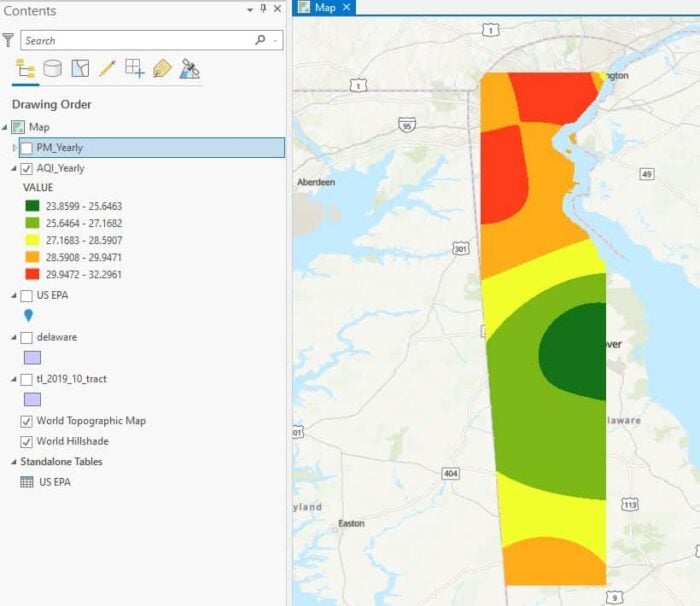
To perform spatial interpolation for AQI_Yearly in ArcGIS Pro;
- Set “Input point features” to displayed EPA data.
- Set “Z value field” to AQI_Yearly.
- From the environments tab, set Processing Extent and Mask to US State or County boundary.
- Click “Run” to perform spatial interpolation for AQI_yearly data.

A graph can be created to study the relationship between the PM_Yearly and AQI_Yearly data.
- Right-click on the EPA Data displayed.
- From the drop down menu, select “Create graph.”
- Select “Scatter plot.”

More ArcGIS Pro tutorials
- How To Create Contours in ArcGIS Pro from LIDAR Data
- How to use ArcGIS Pro and Landsat 8 Imagery to Calculate Chlorophyll Index and Global Environmental Monitoring Index
- How to Use ArcGIS Pro for Supervised Classification
- How to Use ArcGIS Pro to Map Flood Susceptibility
- How to Create Public Transport Isochrones in ArcGIS Pro