
Articles

Integrating Spatiotemporal Data with Terra Populous
Terra Populus is a project designed to combine data sets and geographic information to facilitate finding and extracting data for research.
How To Make a Map From Open Data Using a Spreadsheet
Jonathan Goldman explains in this tutorial how to extract an open data feed from a civic data portal and pull it into Google Sheets, and then map it quickly using Geosheets.

Mapping Market Reach
Troy Lambert discusses how colleges can use GIS and mapping technology to better target marketing.

Study Suggests that Men Aren’t Better at Reading Maps Than Women
A recent study tested if there are differences in spatial reasoning and perspectives between men and women.
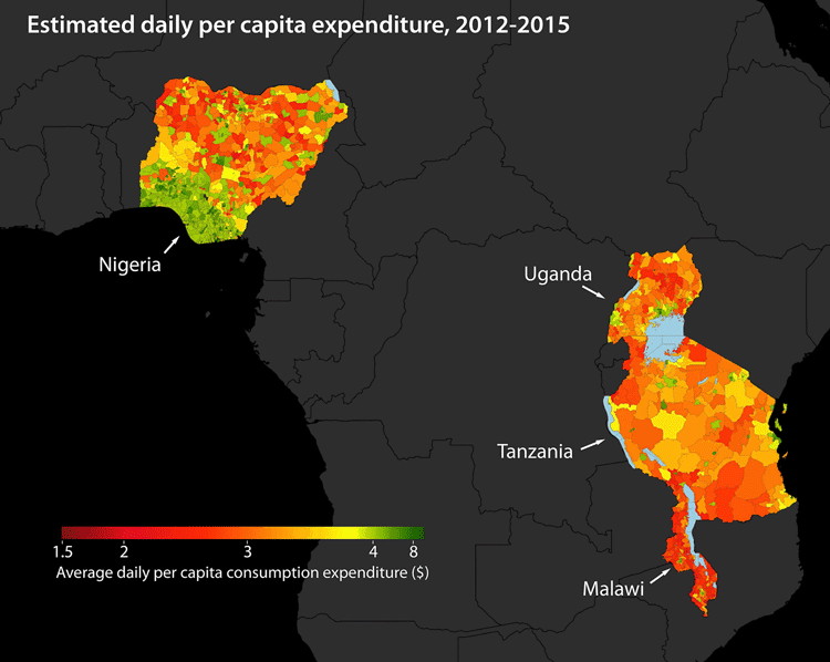
Using Machine Learning to Map Poverty from Satellite Imagery
Satellite images are now being used to map poverty levels around the world using machine learning used to analyze specific poverty data using a convolutional neural network.

Storing Carbon in the Soil Through Regenerative Farming
In partnership with scientists and researchers, farmers are coming up with different ways to keep soil from degrading and releasing more CO2 into the air.

Using GIS to Map Telecommunications
Mapping telecommunication networks is of great importance to both urban and rural regions, particularly as telecommunication networks become even more vital for our daily lives. Terrain, vegetation, urban regions, and other potential interference are often assessed together and GIS tools such as ArcGIS have developed into an industry standard for forecasting cellular tower locations.
Connecting to GPS in Tunnels
Waze is testing out technology it calls "Waze Beacons" to keep drivers connected to GPS navigation systems in tunnels.

EPA Issues Report on Fracking and Earthquakes
According to EPA scientists in North Texas, earthquakes there are likely related to fracking and drilling. Although it is not a new discovery that this link is possible or even likely, an acknowledgement from the EPA is significant.

GIS and Sustainable Energy
GIS has become a critical planning and management tool for addressing where and how to enable sustainable energy efforts.

GIS and Anti-Crime Measures
This article takes a look at methods which demonstrate the wide and growing field of crime prevention utilizing spatial and GIS approaches.

A Look at KML, an Open Standard to Represent and Visualize Spatial Information
Yang Zhang, associate professor, and Matthew W. McBroom, professor, with Stephen F. Austin State University, provide a brief systematic introduction to KML (Keyhole Markup Language) files.
Teaching GIS in Elementary School
Research on how to best implement GIS education for K-12 has looked at the use of web-based GIS and data that is understandable at different levels.

Sunday Maptinee: Teaching Geography Through Humor
The Map Men have created a series of geography themed episodes highlighting some pretty cool information about the world around us.

Turning the Continents of the World into Animals
Kentaro Nagai continues the tradition of envisioning"maps as animals" and reworks the continents as part of his artistic piece from 2007 entitled, "The Twelve Animals."

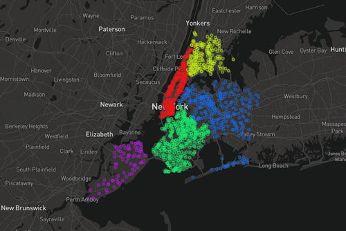
Geography of Fortune 1000 Companies in 2016
This article takes a look at the geographic distribution of Fortune 1000 companies within the United States for 2016.
Fortune 1000 Companies List for 2016
Table of Fortune 1000 companies which can be filtered to produce a list Fortune 1000 companies by state or by city.
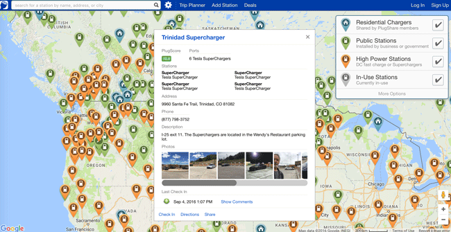
How GIS is Helping Electric Cars on the Road
GIS is playing an important role by helping drivers plan travel that factors in charging stations.

Mapping the Movement of Migrants
A mapmaker named Max Galka created an interactive map that shows the migration of the world’s human population between 2011-2015 using UN Population Division data

GIS, Pollution, and Health
GIS has been used to assist in showing strong or weak links for given health conditions to different types of pollutants.

Saltiest Places on Earth
The Dead Sea is one of the saltiest places on Earth, but contrary to popular belief it is not the saltiest location in the world.

Is Germany Landlocked?
The easiest way to tell if a country is landlocked is to take a look at a map of the country and the surrounding geography.

GIS and Visualizing Atmospheric Science Data
The use of new data models has allowed more traditional GIS data models to be integrated with those used in atmospheric science.

Sunday Maptinee: Grid Corrections
A Dutch artist travelled to locations around Oklahoma and Canada to take pictures of the turns and detours that make up grid corrections in the roads.

Cartography of Japan
A new book has surveyed maps created by cartographers in Japan spanning 500 years.

Why the Sun Looks Smaller at Higher Altitudes
At high altitudes, the sun's aureole is much smaller because there is less atmospheric distortion from dust, pollution, or moisture spreading out the sun's visible rays.