
Articles

Using GIS to Monitor the West Coast Wildfires
With fires raging in California, Oregon, and Washington, scientists, activists, geospatial companies, and others are using GIS and spatial data to better inform and protect communities.

Earliest Known Map Showing Florida
Published in 1511, the first map to show the peninsula of Florida is also a map of other firsts.

Satellite Imagery of the Widest River in the World
The Copernicus Sentinel-1 mission captured this satellite image of the Amazon river that has been processed by the combining of two polarisations into one image.

Germany Plans to Curb Light Pollution to Save Insects
In the latest bid to reverse the dramatic insect decline, Germany is planning on dimming its lights.

How to View Animated Satellite Imagery of the California Wildfires
Users can quickly make animations of the California wildfires using imagery from NOAA's GOES-West satellite.

Ocean Warming is Driving the Wrong-Way Migration of Some Benthic Species
Some benthic species are spawning earlier due to ocean warming.

Earthquake Detection Using Smartphones
Using aggregated accelerometer data across many smartphones, many of us can now better access a large-scale earthquake warning system.

Smoke from the California Fires Over the Pacific Ocean
NASA’s Terra satellite captured this image of smoke from the August Complex fire and other fires burning in California as it blows out over the Pacific Ocean.
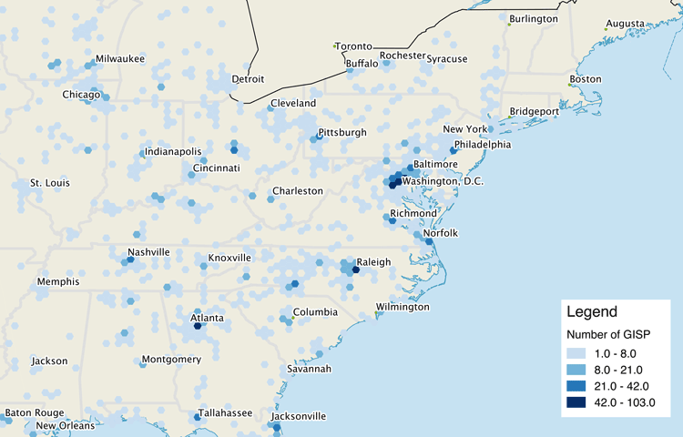
A Look at Where the GISPs Are
A recently published study took at look at the geographic, gender, and career characteristics of those that are certified Geographic Information Systems (GIS) Professional (GISP).
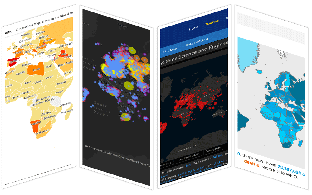
Online COVID-19 Maps and the ‘Infodemic’
Researchers have been evaluating the effectiveness and accuracy of online CoVID-19 maps.

What are Barrancas?
One place to find barrancas is at the lower elevations of La Malinche volcano in central Mexico.

Hurricane Laura Made This River Flow Backwards Temporarily
When Hurricane Laura came onshore near Texas and Louisiana, its winds were so strong that it pushed the waters of the River Neches backwards for about 12 hours.

Using Open Source Geospatial Tools to Find Missing Building Footprints
Researchers have developed a methodology that uses remote sensing measurements to predict completeness in coverage of building footprints in OpenStreetMap data.

Mapping Tropical Forest Quality from Satellite Data
Researchers have created high resolution maps of tropical forest quality using remotely sensed data from NASA satellites.

Guess the City Based on Street Video
City Guesser is an online geography game that uses audio and visual street video to provide hints about where in the world the city is located.
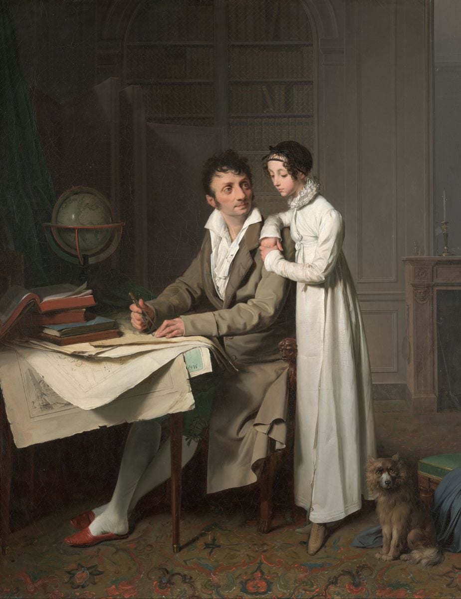
The Geography Lesson (Portrait of Monsieur G. and His Daughter)
The Geography Lesson is a fine art painting by French painter Louis-Léopold Boilly from 1812.

Mapping Climate Refuges
Climate refugia are places which can withstand climate change better than other regions and buffer the impacts of climate change.

The Spatial Internet of Things
The development of small sensors is providing a variety of real-time geospatial data.

Track Real-Time Air Pollution With this Crowdsourced Map
One way to track air quality at the local level is by visiting PurpleAir, an interactive map that pulls in crowdsourced data.

Find Open Sources of Elevation Data With OpenTopography
OpenTopography is a portal that provides access to open sources of topographical datasets and processing tools.

Desertification in Romania
In their Sixth National Communication on Climate Change and First Biennial Report from 2013, the Romanian authorities estimated that the area affected by desertification makes up for about 30% of the country’s total area.

How Many Oceans are There in the World?
The world is made up of: one global ocean, three major oceans, four historic oceans, and five world oceans.

First Published Map of Wales
Humphrey Llwyd developed the first map focused on Wales which was published in 1573.

Self-Guided QGIS Courses
These six QGIS courses are available for free self-guided learning.

Google Adds Near Real-time Wildfire Boundaries to Search and Maps
Google pulls data from NOAA's GOES satellites to map out wildfire boundaries.

Linking Geological Events to Aboriginal Oral Tradition and Stories
Recent findings about the existence of human civilization dating back 50,000 years suggests major geological events have been described in Aboriginal oral tradition and stories.