
Articles

Advancements in Mapping Jellyfish: Integrating Remote Sensing and Geospatial Technologies
Mapping swarms of jellyfish has significantly improved due to a combination of remote sensing data, UAV and satellite data, and algorithms that estimate jellyfish migration based on current data.

Ten Tips to Prepare for a GIS Job Interview
Got a portfolio? Kristina Jacob presents ten tips for preparing for a GIS job interview.

Mapping Small Bird Migrations
Our understanding of bird migrations is changing as a result of tracking devices on birds, especially for small bird species.
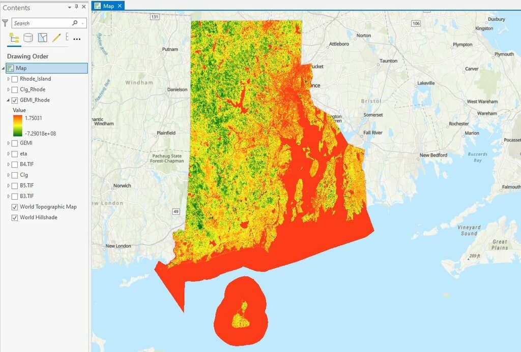
How to use ArcGIS Pro and Landsat 8 Imagery to Calculate Chlorophyll Index and Global Environmental Monitoring Index
Learn to create a chlorophyll index using Landsat 8 imagery in ArcGIS Pro with this step-by-step GIS tutorial.

Finding GIS Data and Using QGIS to Map Caves
Dackery Geiman outlines the challenges he encountered finding geospatial data about caves and using QGIS to map cave density in Missouri.

GIS in Land Use Planning and Surveying
Michael Parks explains how he used GIS data and imagery to develop geospatial analysis and maps to recommend potential base camp sites.

Using GIS to Map Fly Fishing Destinations
William Bakemeyer describes how he used QGIS and open source data to create a fly fishing map.

Remote Sensing for Carbon Offsetting
Remote sensing and geospatial technologies are being harnessed for carbon offsetting efforts.

QGIS from a Graduate Student’s Perspective
Kent Campbell writes about how he has come to view the benefits of using QGIS as a graduate student.

Which States are Part of New England?
New England is a geographic region in the northeastern tip of the United States that contains six states.
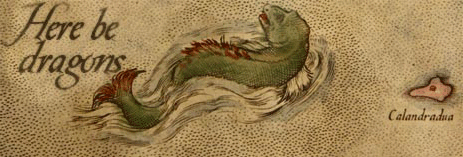
The Map Myth of Here Be Dragons: The Facts and Fictions of Mapmakers
What lies at the edge of the known world? Cartographers over the ages have used different ways of showing the unknown.

Lost Underground Rivers
Cities like London and New York City have a long history of paving over rivers.

Notable Cartographers and Their Maps
Notable cartographers have shaped our understanding of the world with their maps, offering remarkable contributions throughout history.

Mapping Heat Vulnerability from Satellite Data
Satellites are being used to measure heat not only on urban heat islands, but also on farms and other locations where rising temperatures are having an impact.

Earth at Night
Nighttime lighting is when the effect of humans on the environment is especially pronounced.

Mapping the Earth’s Freshwater Bodies
Over 95% of the world's lakes, rivers, and freshwater reservoirs will be measured by a new satellite mission called Surface Water and Ocean Topography (SWOT).

Crowdsourcing Archaeological Data with Participatory GIS
People with little or no training in archaeology or geographic computing systems can build GIS data using Humap's Placemaker.

Using Open Source Geospatial Data in Journalism
Geospatial data such as satellite imagery can be used by journalists to verify news stories.

Visual Geography: the Shape of Land Near the Oceans
A visual dictionary of geography words that describe the shapes of land near ocean water.

The Global Evaporation of Lakes
Researchers used satellite imagery and modeling to calculate the evaporation volume across over 1.42 million natural and artificial lakes.

How to Add Data from ArcGIS Online to QGIS
Adding data from an ArGIS Online Map Service or Feature Service into a QGIS map project is fairly easy and quick in most instances.

Landsat: Longest Running Earth Imagery Program
With satellites in orbit since 1972, the Landsat program is the longest running Earth observation program.

Tallgrass Prairie
The American Tallgrass prairie was once one of the largest and most diverse continuous ecosystems on the planet.


Biogeography Definitions
Here are some common terms in biogeography, a field of geography that studies the distribution of species.

A Roundup of Geospatial Podcasts
Here's a list of GIS / geospatial podcasts you can listen to.