
Articles

A Review of the State of Crowdsourced Geospatial Data
A review in the Journal of Remote Sensing provides an updated look at the benefits and concerns when it comes to collaborative geospatial data collection.
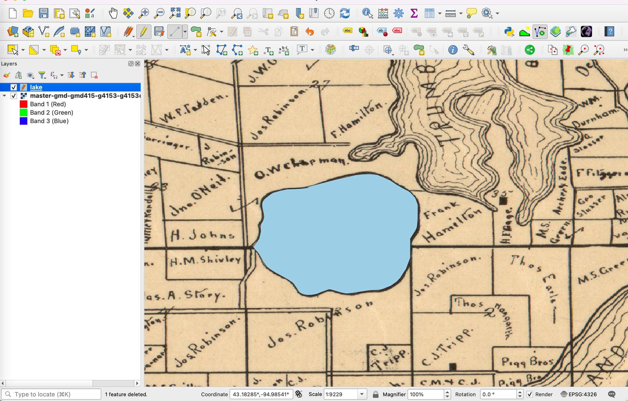
Using AI to Digitize Data From Scanned Maps
This AI-powered plugin is designed to automate the digitization of data from scanned maps and PDFs in QGIS for GIS users.

Learn How to Georeference a Map in QGIS Using GIS Data
Learn how to georeference scanned maps in QGIS using reference GIS data and control points when no coordinate grid is available.

The Coastline Paradox: Why Measuring Coastlines isn’t that Simple
The coastline paradox is the concept that the measured length of a coastline will change depending on the scale of the GIS data used for the measurement.

What is England’s Highest Mountain?
Found at 978 metres (3,209 ft) above sea level, Scafell Pike is located in Lake District National Park in Cumbria.

Sea Otters are a Keystone Species
Keystone species are plants or animals, like the sea otter, whose presence in an ecosystem plays a crucial role in its health.

Mapping Glacier Loss in Western Canada
Researchers are using remotely sensed data and satellite imagery to map glacier loss in Western Canada.

Change Detection Using Kernel Density Analysis in ArcGIS Pro
This GIS tutorial provides step-by-step instructions for how to use two point datasets to detect changes in ArcGIS Pro using kernel density.

Teaching GIS to Kids to Help Them Learn Spatial Skills
Tips and resources to help you get started with teaching your children about GIS and mapping.


Georeferencing Scanned Maps in QGIS Using Graticules
This GIS tutorial teaches you how to assign geographic coordinates to a scanned map in QGIS using a process known as georeferencing.
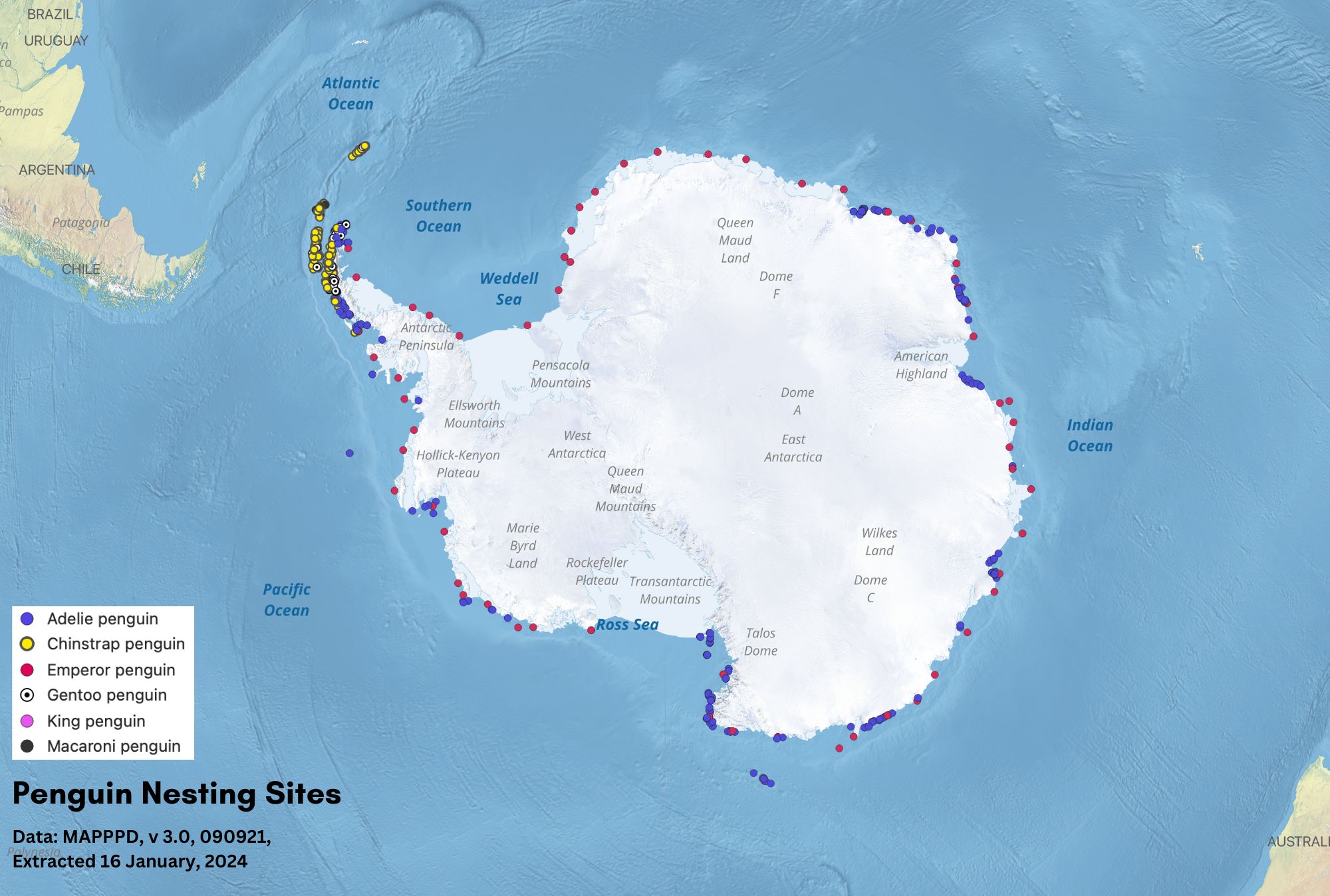
Geography of Penguins
Discover where penguins live, from Antarctic sea ice to tropical islands, and what shapes their geographic distribution.

Satellite Mapping Reveals the Extent of Human Activity in the Oceans
Satellite imagery, GPS data, and AI are revealing the growing extent of industrial activity across the world's oceans.

Using interpolation to create a surface layer with contours in QGIS
This GIS tutorial shows you how to find elevation data points and create a surface layer and contours using QGIS.

GIS User Groups in the United States
GIS user groups are a great way to network with other GIS professionals on a local level. GIS user groups commonly are organized at the regional level.

How the Beaver-Wolf Dynamic Affects Forests
Researchers are studying how wolves shape forests by limiting beaver foraging, keeping them close to water to avoid predation.

Geography Facts About the Southern Ocean
The Southern Ocean is the Earth's windiest, southernmost ocean and plays a vital role in Earth's environmental health.

Exploring Rainbows and Moonbows
Rainbows and moonbows occur when light is refracted through drops of water in the sky.


What is Snowliage?
Snowliage is when an early winter storm creates a bright white snowfall that contrasts with the red, oranges, and yellow fall foliage of trees.

The Highest 11 Mountains in the United States
Learn about the highest 11 mountains in the United States.

Reintroduction of the Mexican wolf nears 25th anniversary
Reintroduction efforts to improve Mexican wolf populations in the wild began in 1998 and recent populations now exceed 200 wolves.
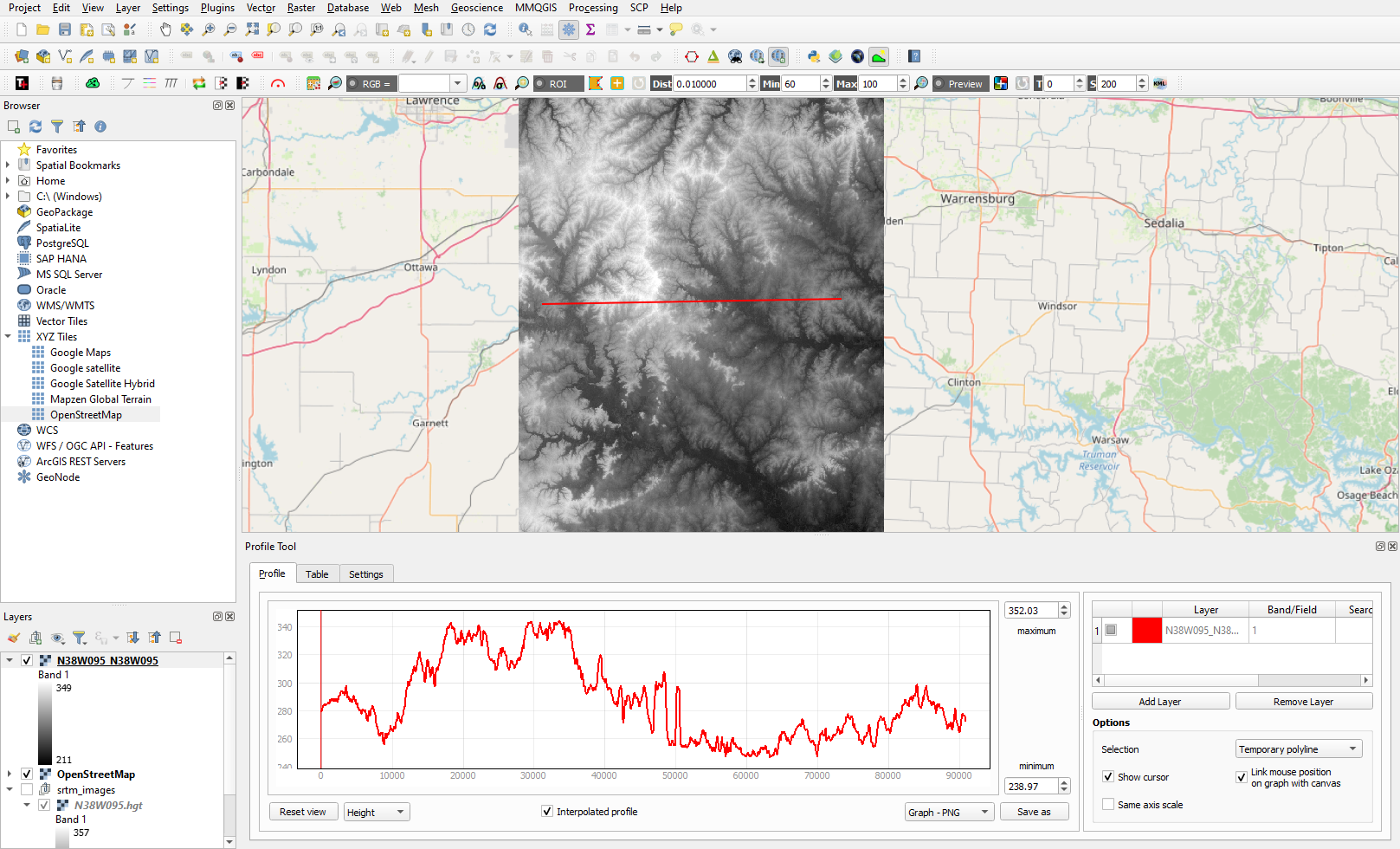
Creating Elevation Cross-Section Profiles with QGIS
Learn to create elevation cross-sections in QGIS with the Profile Tool plugin and SRTM elevation data.

When Will We Reach the 1.5°C Mark with Climate Change?
The Earth is 1°C warmer than pre-industrial times, and it's unclear when we'll reach the 1.5°C climate threshold.

How to Create Isochrone Maps in QGIS
Learn how to create isochrone maps in QGIS to visualize travel times, find the fastest and shortest routes, and analyze accessibility.

How to Track Santa Claus in 2023
Learn about the history of tracking Santa's Christmas travels and how to follow Santa using NORAD's app.